Microsoft Copilot for Azure
Context
With AI rapidly transforming how developers manage and reason about cloud environments, I set out to explore how Microsoft Copilot could support mobile-first workflows without introducing friction or bloat. This work was part of a broader initiative to make Azure simpler, faster, and more intelligent—anchored in company-wide goals to create outcome-oriented, inclusive, and industry-leading experiences across the Azure ecosystem.
Mobile support for Copilot became a key priority to meet user demand for insight, guidance, and confident decision-making, even when away from their desks. I led the end-to-end design strategy for introducing Copilot into the Azure Mobile App, shaping both UX and interaction models from early concept through General Availability. I collaborated closely with PMs, researchers, and engineers across Azure Mobile and Azure Portal to unify experience architecture, evaluate interaction patterns, and co-define success criteria for mobile LLM integration.
Challenge
The challenge was to bring the power of Azure Copilot to mobile without overwhelming users or degrading usability.
Copilot in the Portal was already facing criticism from early users for low response quality, latency, and vague results. On mobile, constraints like screen real estate, multitasking, and environmental context (e.g., on-call engineers troubleshooting at 2AM) made usability even more critical.
Firstly, we needed to figure out how to introduce Copilot in a way that felt natural, useful, and trustworthy on small screens, especially for time-sensitive tasks like resource health, cost insights, and incident mitigation.
Approach & strategy
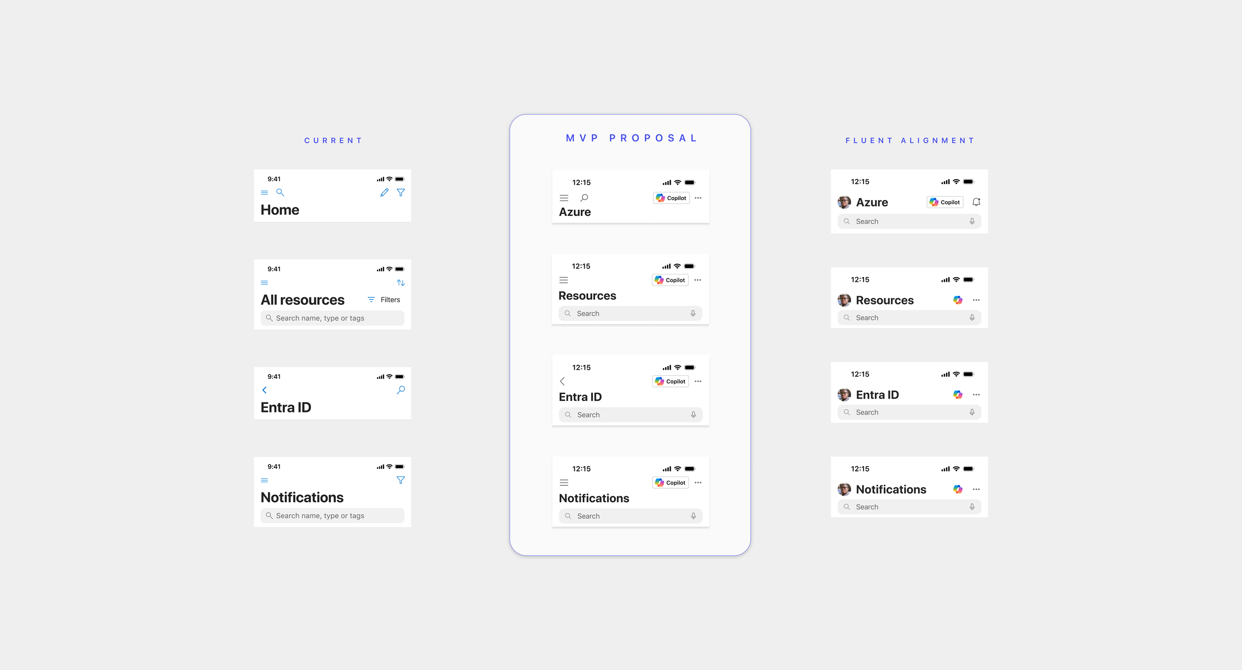
To understand how Copilot could best support this, I designed a "mild to wild" concept exploration ranging from a lightweight, traditional chat entry point to a vision of a Copilot-first mobile app that reimagines the entire interface around natural language interaction.
I grounded these explorations in Fluent design patterns and focused on balancing conversational interfaces with visual clarity and mobile affordances. I partnered closely with our researcher to identify core user tasks, assess expectations around AI support, and validate where traditional UI still outperformed chat-based flows. The goal of using this “mild to wild” approach was to gather insight into the level of AI integration and assistance a user would feel most comfortable with given the complexity of managing a cloud environment.
Execution
Designed a series of progressively ambitious prototypes in Figma, including:
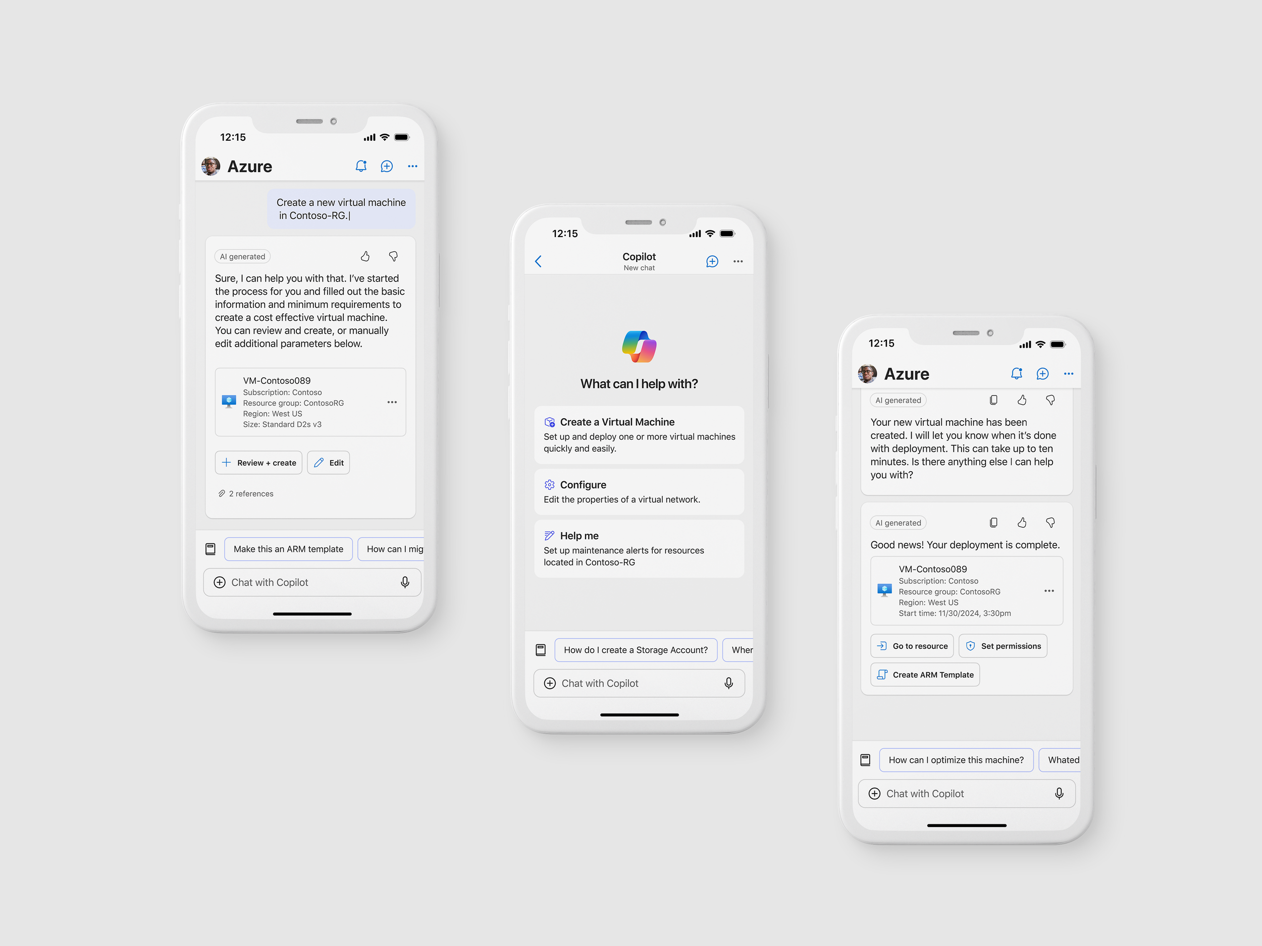
A standard Copilot entry point in the top-right, invoking tray
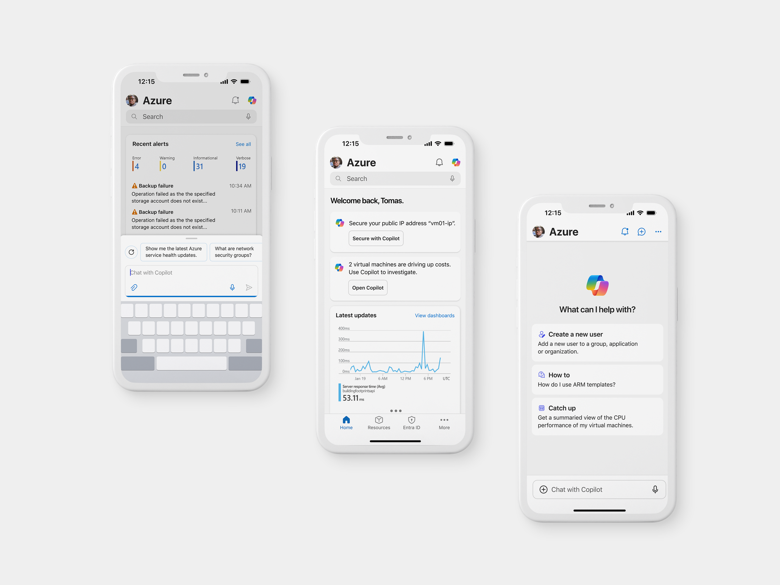
A Copilot-powered Home page with inline “To Do” recommendations
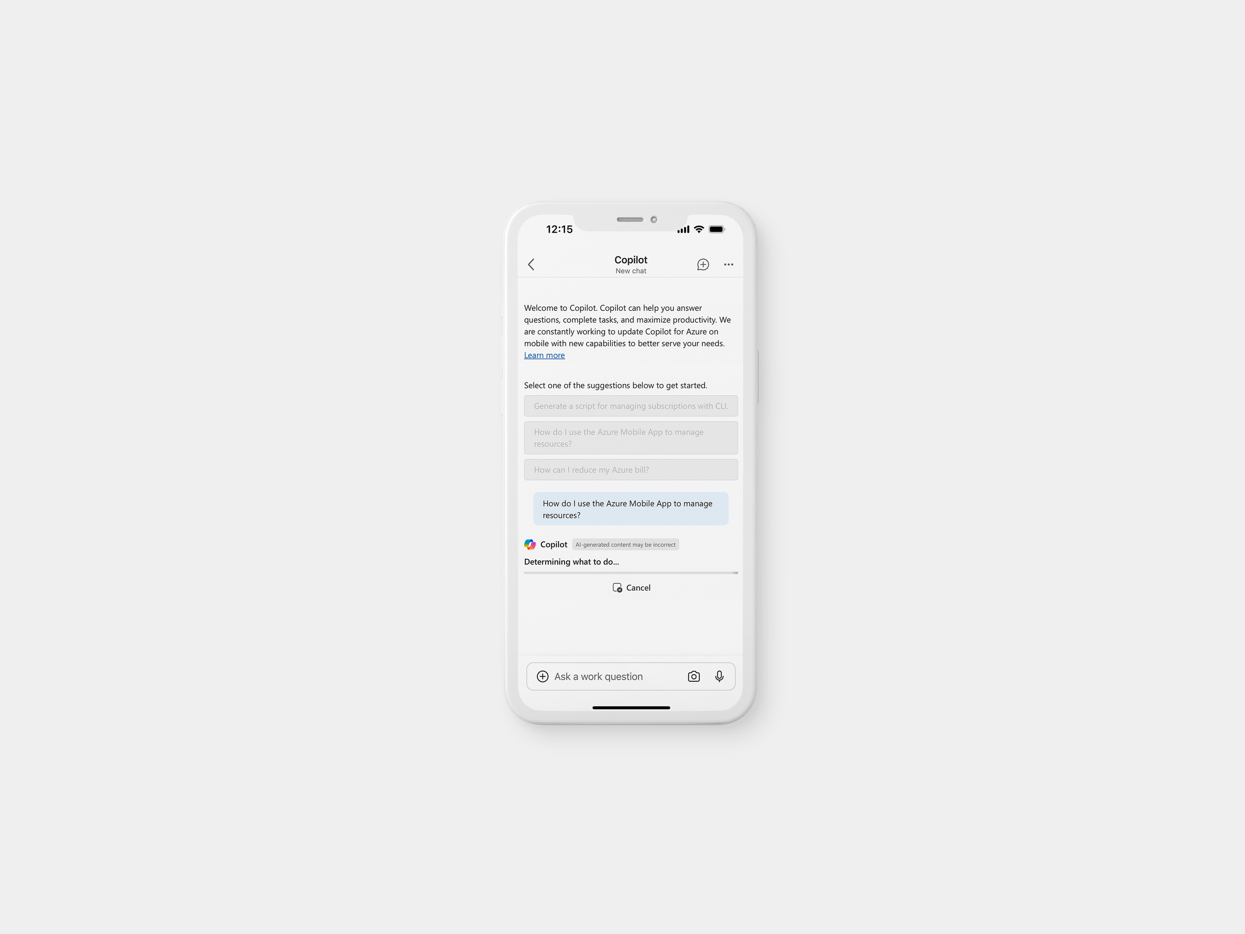
A fully chat-first version of the app where users could complete tasks entirely through Copilot
Collaborated with research to define participant tasks and interview questions for moderated usability studies.
Tested concepts in 45-minute remote sessions, capturing insights on usability, trust, and interface preference across different Copilot experiences.
Mild Concept “User invokes Copilot and spawns half-sheet chat”
A Copilot entry point in top bar, accessible anywhere
Inline suggestions on the Home screen, like “Restart VM” or “Review alert”
Semi-assisted tasks from Copilot
“If it’s context-aware and shows up when I need it, that’s helpful. But I don’t want it getting in the way.”
Mid Concept “Copilot gives suggestions and a full-screen chat”
A standard Copilot entry point in the top bar
Inline Copilot prompts to suggest actions to take
Full-screen chat once user invokes
Copilot performs most tasks with user “permissions”
“Typing natural language is great, but I still want to see the exact steps it’s taking before it does anything.”
Wild Concept “The entire app is Copilot-powered”
A fully chat-first mode where users complete tasks solely via Copilot
Proactive prompts based on telemetry or past behavior
Copilot performs tasks with simple user acknowledgement
“I missed being able to just glance at metrics or alerts. Chatting everything out takes longer than just seeing a summary.”
Outcome & impacts
Key takeaways from user research informed design recommendations:
Users wanted predictable, assistive behavior over full automation
Keep Monitoring insights like metrics and charts easily accessible
Users valued repeatability and memory—requesting chat history and saved responses
✅ Azure Copilot launched GA in Mobile (April 2025)
✅ 125K+ Monthly Active Users with 10.2% MoM growth
✅ Shared codebase with Portal reduced dev effort and improved UX consistency
📈 +17% increase in mobile Copilot engagement
📉 35% drop in Copilot bounce rate due to improved UX
Reflections
This project reinforced the importance of proactive and foreshadowed design especially when introducing AI assistants into environments where users already have well-defined workflows. We found that a heavy-handed or overly chat-forward experience created friction; subtle entry points and well-timed suggestions were far more effective in encouraging adoption without disrupting flow.
It also reminded me that great UX isn't always measurable by speed or efficiency. Some of the most meaningful insights came from simply listening to users, how they felt, what they worried about, and what helped them feel in control. Qualitative research was essential in guiding thoughtful, human-centered design decisions that would’ve been missed with metrics alone.