KonMari: Sparking joy in a product
Context
This project was part of Microsoft’s Ability Hack Executive Challenge for Hackathon, focused on accessibility and disability-related innovation. Our team set out to reimagine the Azure Portal through the lens of inclusive design, with a focus on neurodivergent users, while still delivering improvements for all customers.
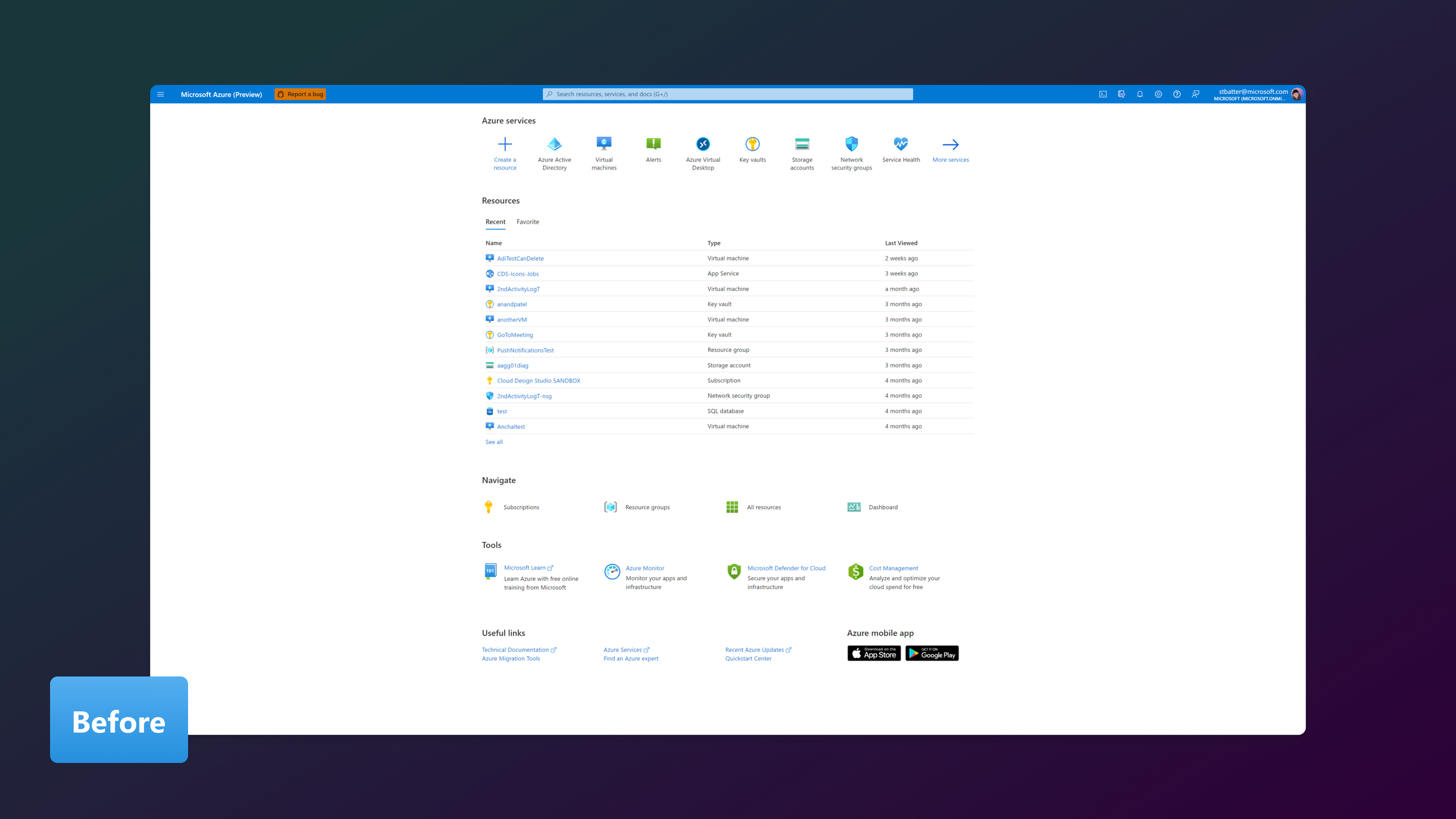
The work was inspired by Marie Kondo’s philosophy of tidying: removing clutter, and creating an experience that sparks joy. Azure’s Home page at the time was densely packed, with redundant sections, low discoverability for important features, and an intimidating enterprise look and feel.
Challenge
We needed to create a lighter, cleaner, and more discoverable experience without losing productivity or familiarity. We knew from previous studies and qualitative feedback that the portal:
Overwhelmed users with dense information and repetitive navigation
Buried critical features like Alerts and Recommendations
Offered no personalization to match diverse user roles and workflows
Felt intimidating for newer engineers and students due to its enterprise-heavy aesthetic
Approach & strategy
Focus Groups: Two moderated sessions with neurodiverse users to observe navigation habits, customization preferences, and discoverability of new features. We had open-ended conversations with our participants, which encouraged candid feedback, and suggestions for improvement.
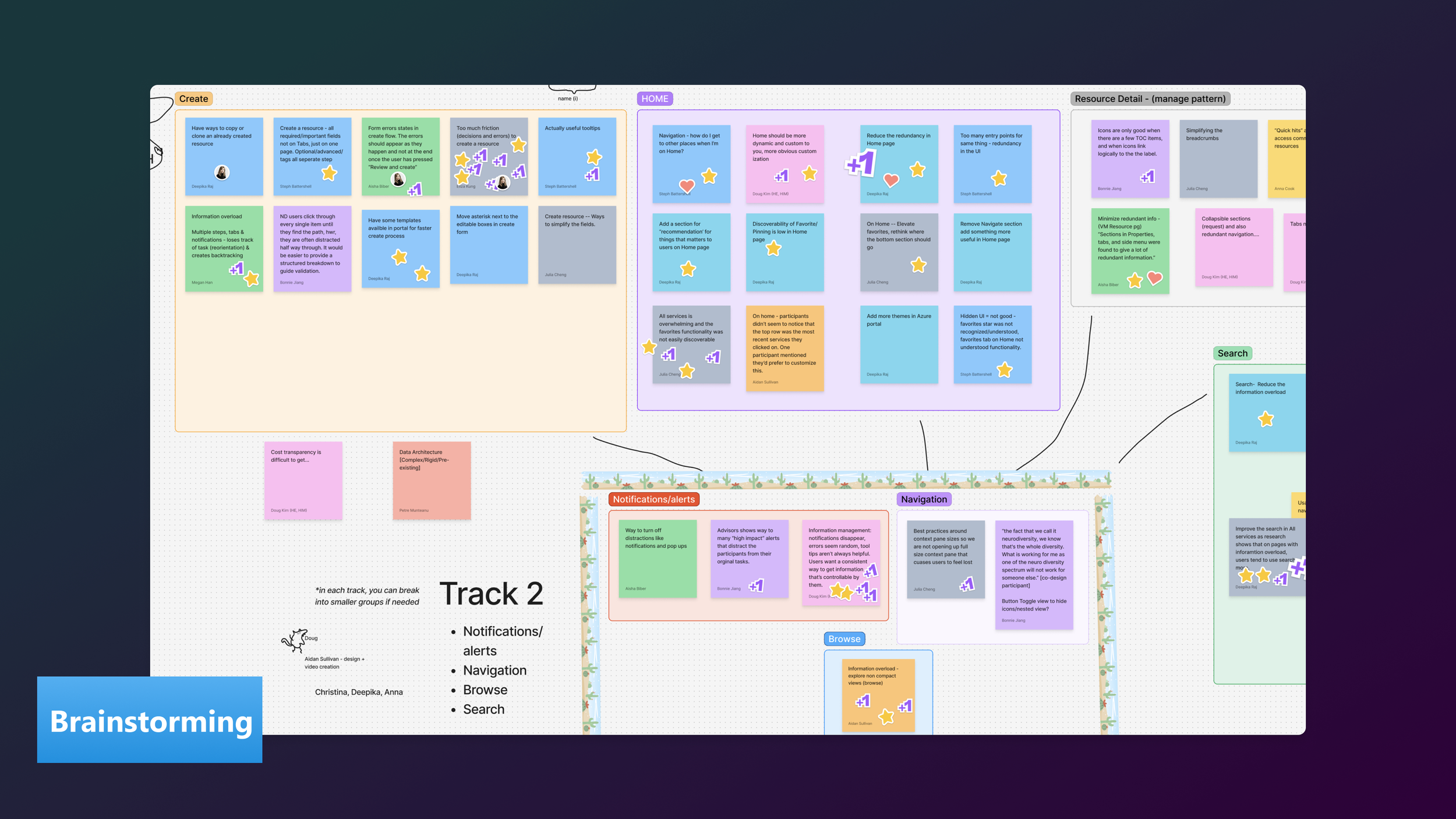
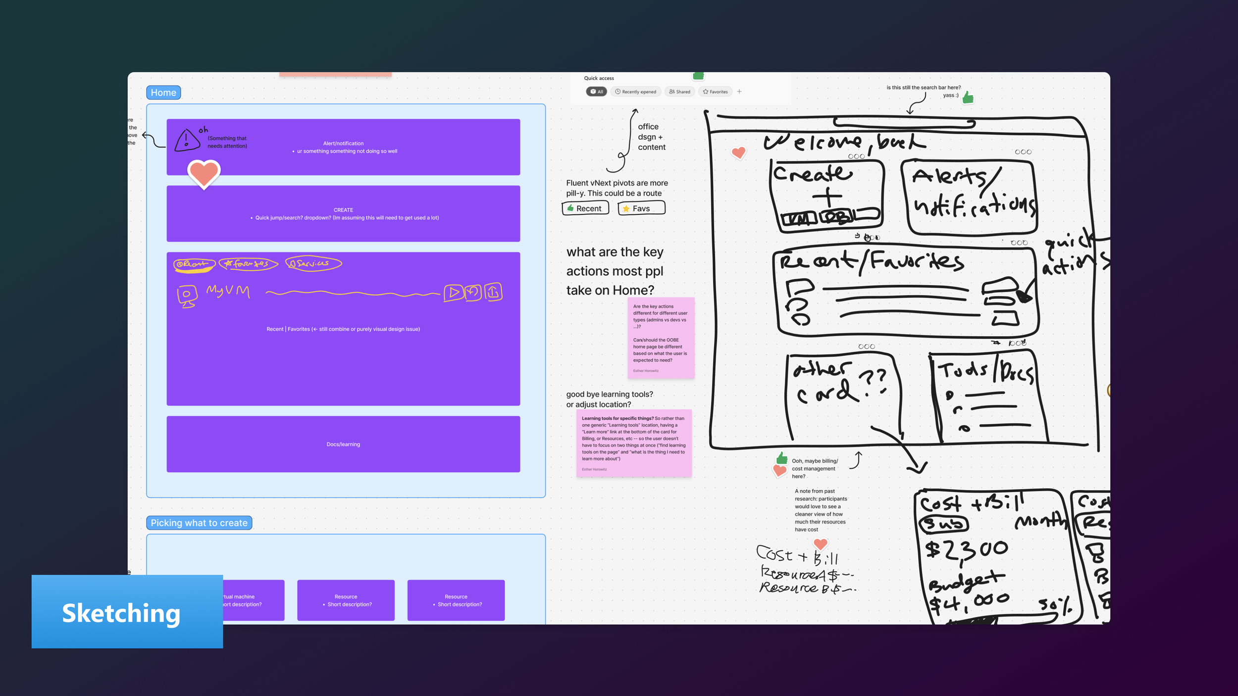
Breakout-sessions: I led design exercises with other designers and researchers across the org to explore the portal’s Home page and resource alerts experiences based on the participants feedback.
Exercises included FigJam brainstorming, wireframe sketching, and word mapping activities. From there I ensured that the design teams:
Applied inclusive design principles and co-designed with users of varied abilities, focusing on reducing cognitive load and improving visual clarity.
Prototyped multiple UI treatments like alternative card layouts, and tab vs. pill navigation.
Explored personalization through customizable and savable templates, and an editable Home layout.
Reduced redundancy by removing repeating items, UI, and sections.
Continuously tested and iterated adhoc with our co-design participants for rapid development of ideas.
Prototypes
The key to the projects success was our collective ability to rapidly iterate on ideas presented by our participants. If someone expressed frustration around having to complete a long workflow form, we talked through ways that might ease their anxiety around it, and came up with a solution on the spot: why not let users simply save their work. This way of working let to presenting simple prototypes each day during the hackathon, to test our implementation and theories.
Prototypes Tested
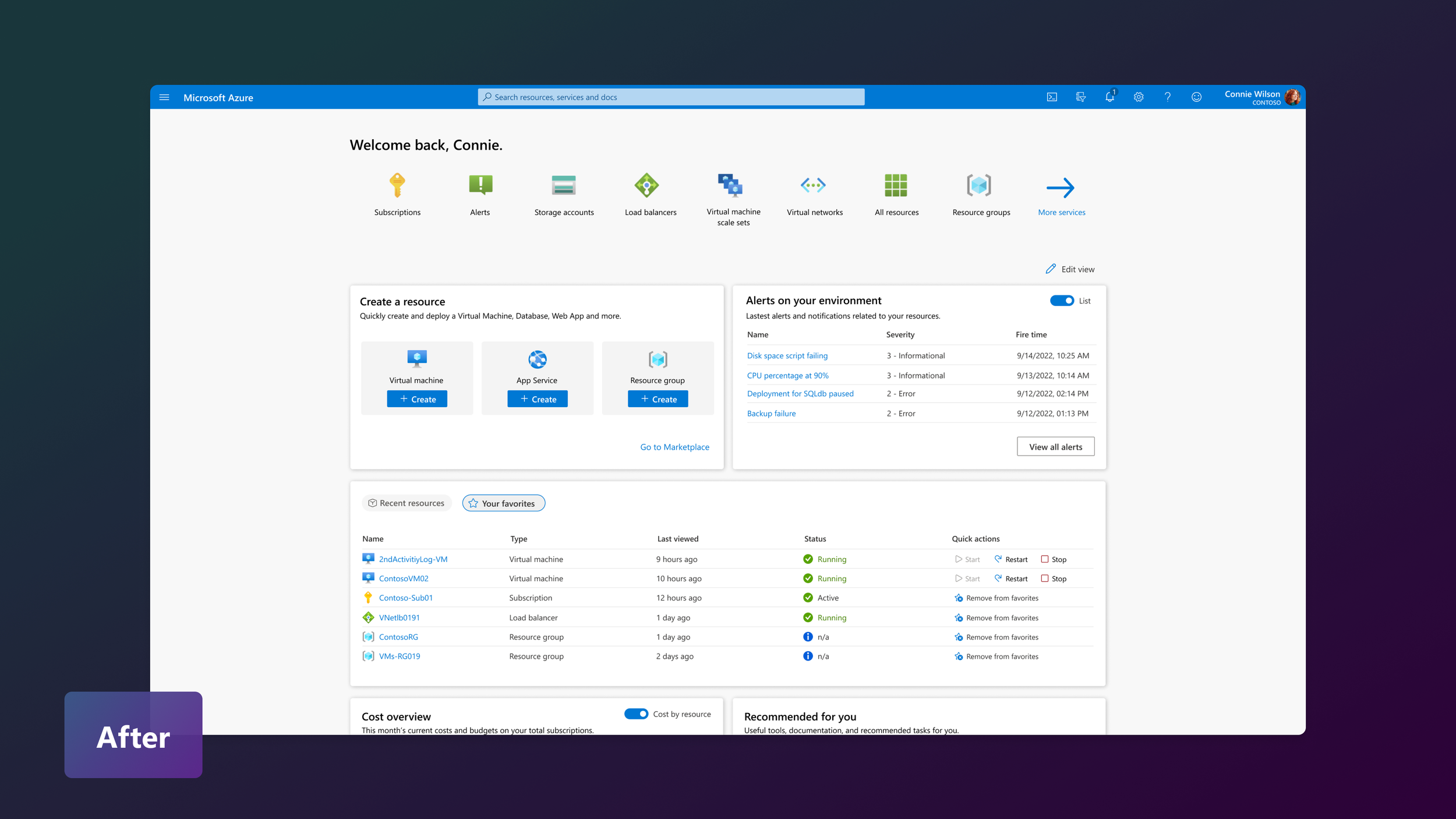
Action-oriented Home: Recurring feedback showed that many users tend to skip the Home page entirely, opting instead to build personalized dashboards with the information they actually need. We wanted to understand how to make the Home experience more purposeful—especially for neurodivergent users who described the current layout as sparse and lacking clear direction.
During co-design sessions, participants shared that they often didn’t know where to start or what value the Home page provided. When we explored which actions or alerts would be most helpful for their day-to-day work, the strongest themes were quick actions, detailed alerts, and clear resource status—all critical for users managing high workloads or on-call responsibilities. I proposed cards that bucketed these actions into distinct areas: quick creation of resources, list and chart views of recent alerts, and a clear status column in the favorite resources section. Overall, our co-designers felt the new direction was more helpful, and let them get started with their workflow more quickly.
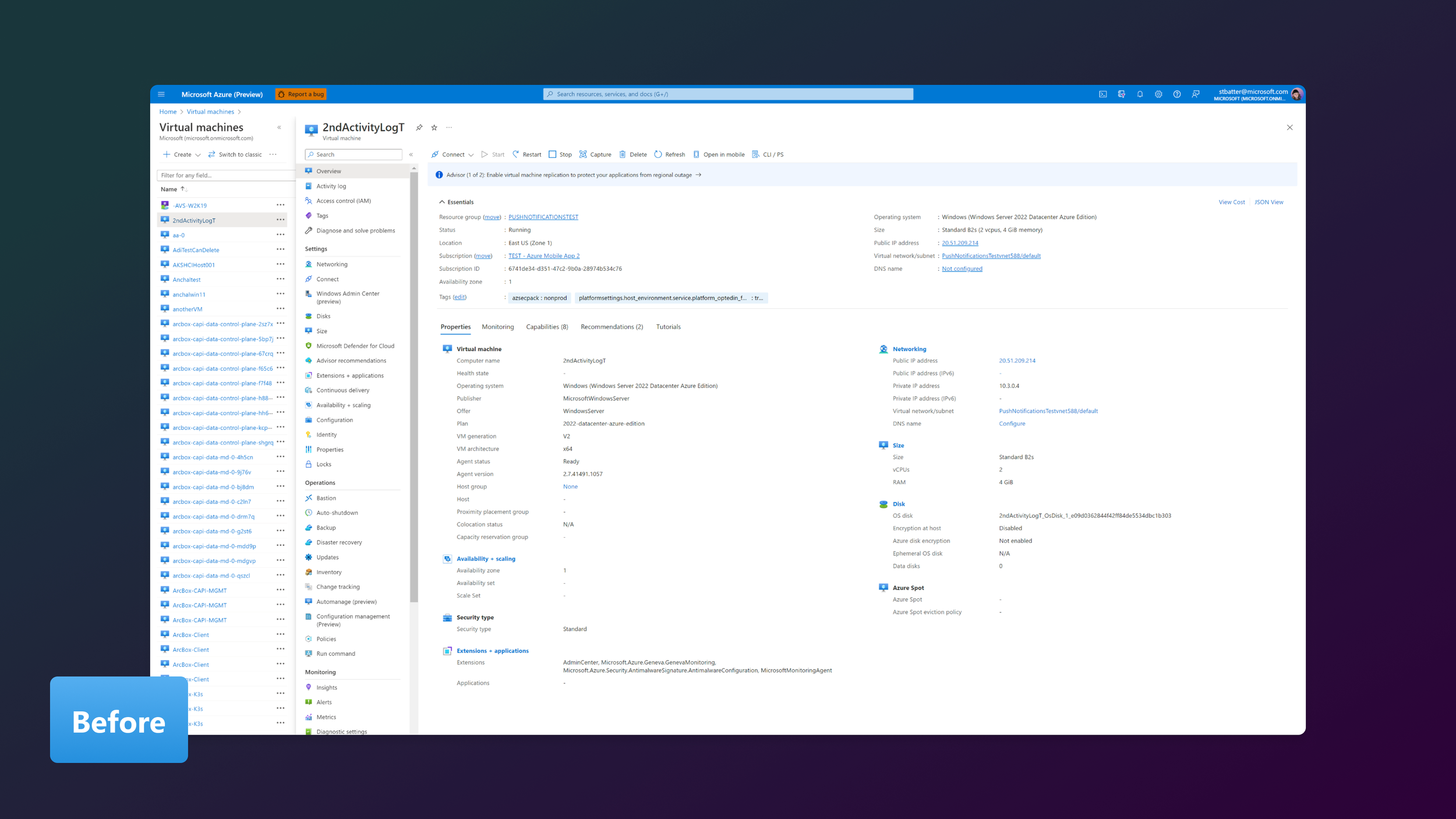
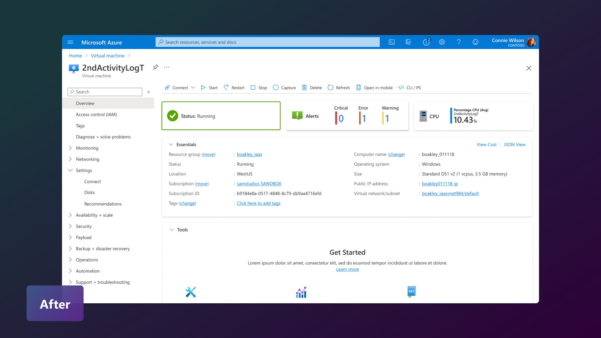
Status and metric-centered Resource Overview: Resource overview pages in Azure are where users manage and configure individual resources such as virtual machines and networks. Today, these pages feel dense and overwhelming, packed with properties, settings, metrics, and add-on features. For neurodivergent users, this cognitive load can slow task completion or lead to task abandonment altogether.
In response to this feedback, our design team reimagined the layout to better organize content into clear, card-based sections. We used color, spacing, and typographic hierarchy to surface key information and guide the user’s attention. When tested with our co-designers, this approach received highly positive feedback, with participants noting a reduction in anxiety and improved ability to focus.
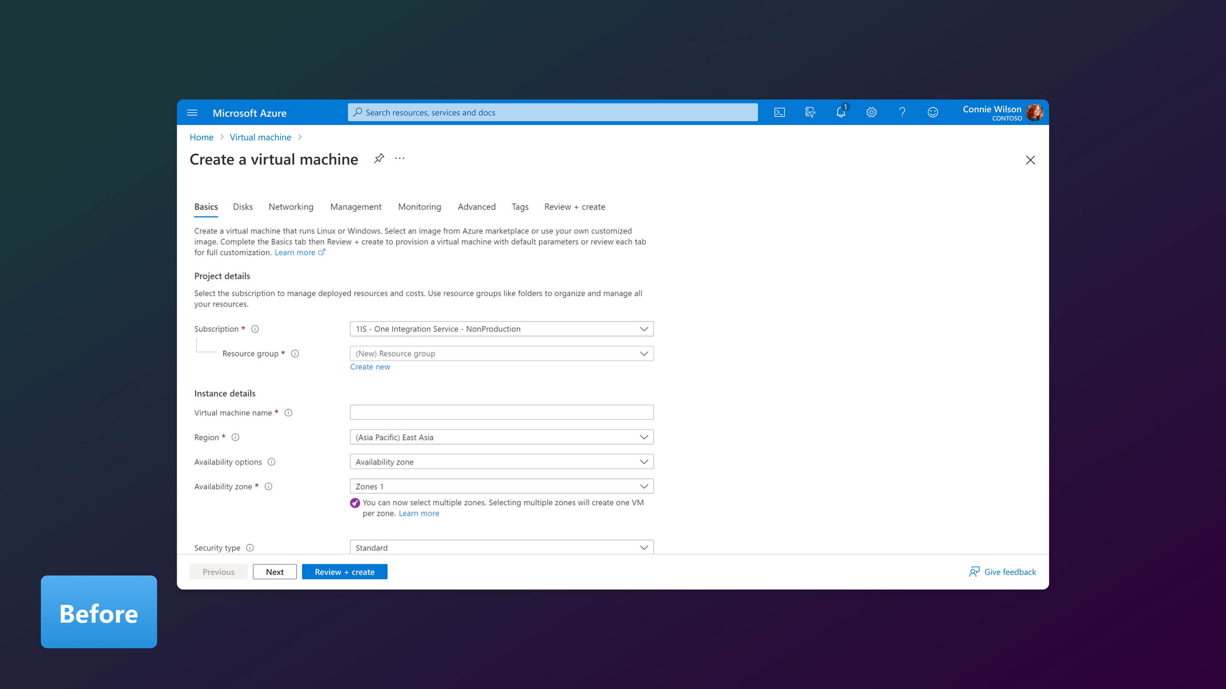
Create a resource wizard:Previous research revealed that creating a resource in Azure can feel lengthy and unforgiving, with multiple configuration steps and prerequisites to manage. Many users, frustrated by the UI, choose to deploy resources through the CLI instead—a clear signal that the current experience is too cumbersome.
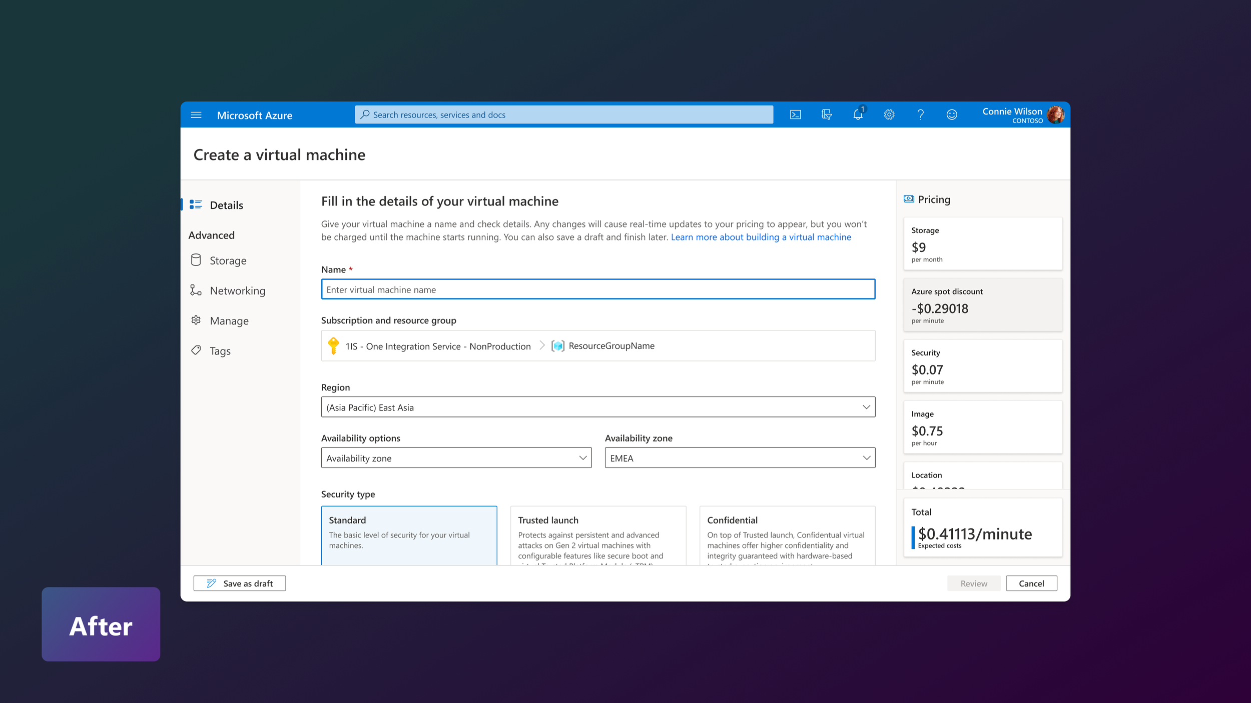
During co-design sessions, participants pointed out the excessive whitespace and lack of guidance throughout the flow. Several also mentioned not realizing the cost implications of their selections until reaching the final deployment step. To address this, our team redesigned the experience using a three-column horizontal layout. Users can now track their progress on the left, configure settings in the center, and view real-time cost estimates on the right. This structure reduces cognitive load and makes the flow more transparent and predictable.
We also introduced a “Save as draft” option, allowing users to pause and return later without losing their work. This small but meaningful change was met with positive feedback, as participants said it gave them a greater sense of control and confidence while configuring complex deployments.
Outcome & impacts
Award-winning outcome: Won 1st place in the Executive Challenge category at the Microsoft Hackathon
Higher clarity and discoverability: Participants called the card layout “cleaner” and “easier to see what each section entails” and said it was “quick to pull your eyes into each section”
Reduced cognitive load: Lighter visual treatment, shorter resource lists, and pill navigation made the UI less intimidating. One participant said, “This looks much better… the shorter recent list makes it feel lighter”
Validation of personalization: Strong interest in custom folders and role-based templates, with one participant noting, “If I could group by project, that would be a game-changer for me”
Feature prioritization:
Alerts should have their own section
Recommendations must be relevant or be dismissible
Recent resources and search are the most-used features on the Home page
Reflections
This work reinforced that inclusive design benefits all users, not only those with specific accessibility needs. Feedback from neurodivergent participants led to cleaner layouts, reduced redundancy, and better visual hierarchy, which also improved the experience for neurotypical users.
Winning the Executive Challenge confirmed that this was more than a strong Hackathon idea. It was a strategic, high-impact design improvement with the potential to reshape one of Azure Portal’s most important entry points.
