Destiny 2: UI for a AAA game
Context
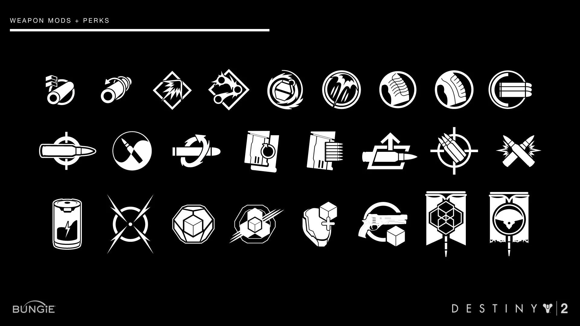
Destiny 2 followed the massive success of Destiny, with an active and deeply engaged fanbase expecting both visual evolution and continuity. I joined the team during a critical final push toward launch, helping craft over 400 in-game icons that would guide decision-making, reinforce immersion, and hold up under the pressure of real-time play. As a UI artist, I was embedded in the UX team and worked directly with engineers, designers, and gameplay leads to integrate a full set of visual assets into the live game.
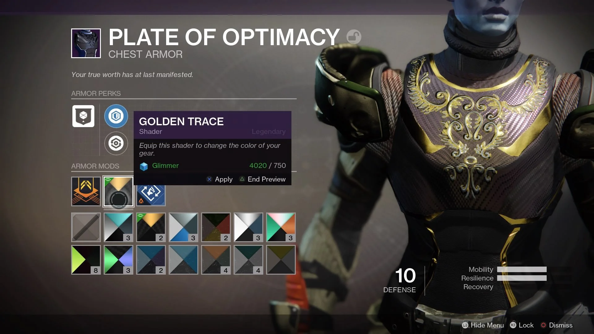
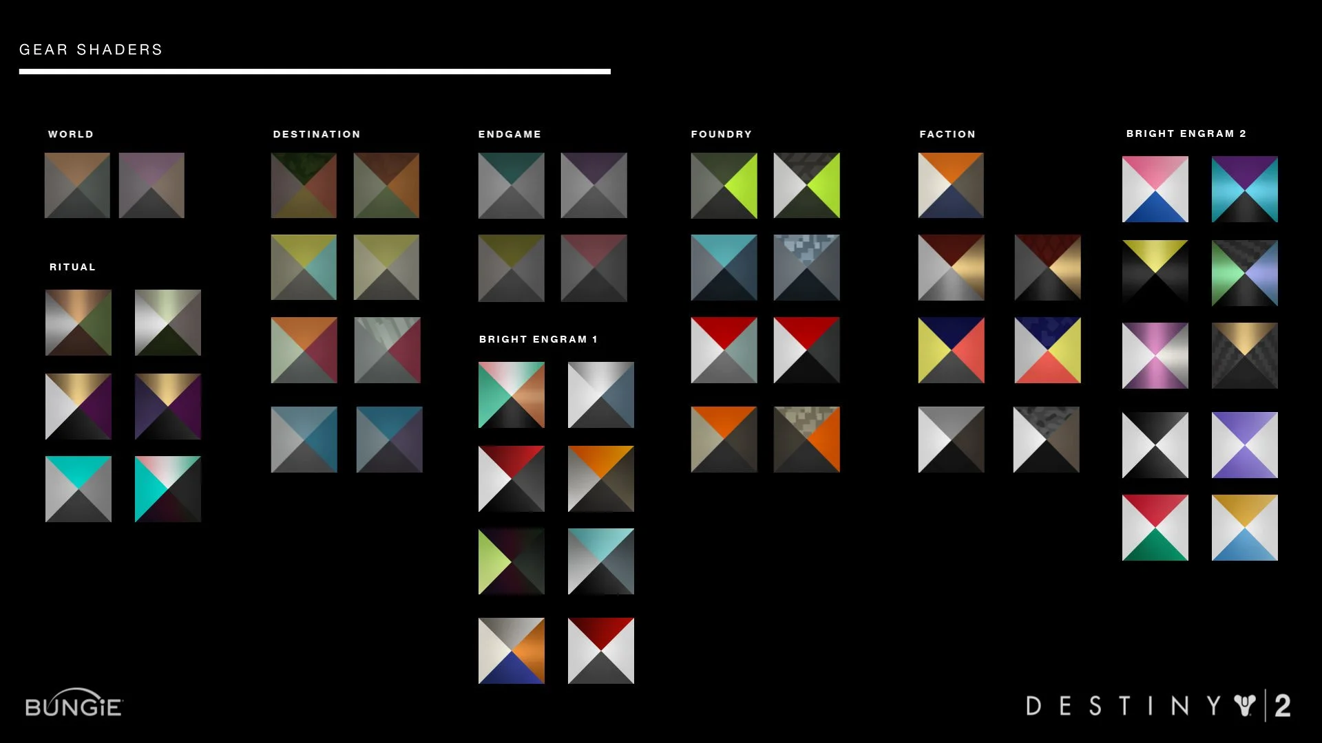
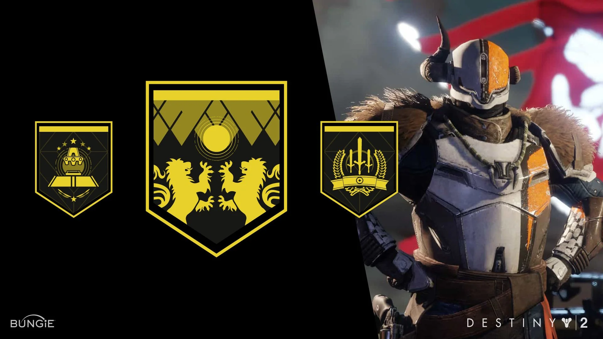
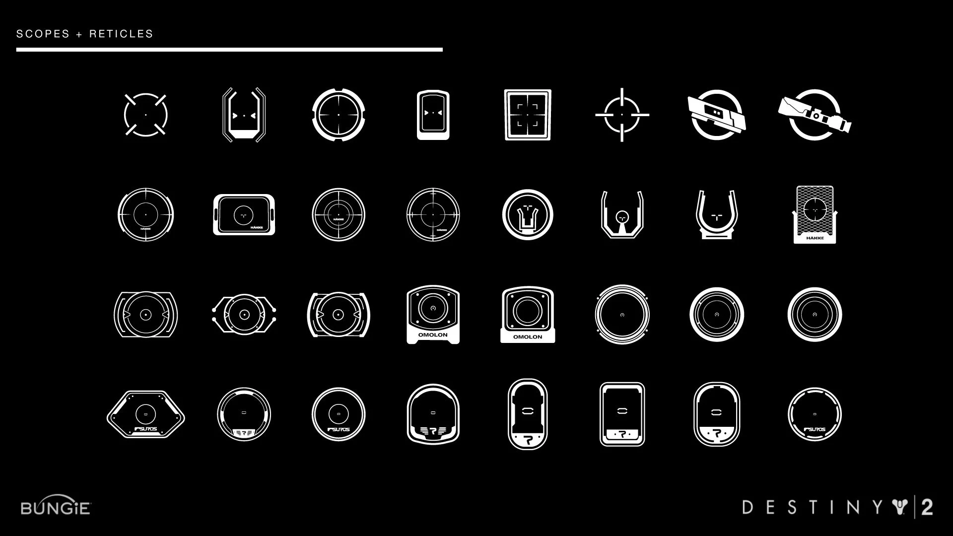
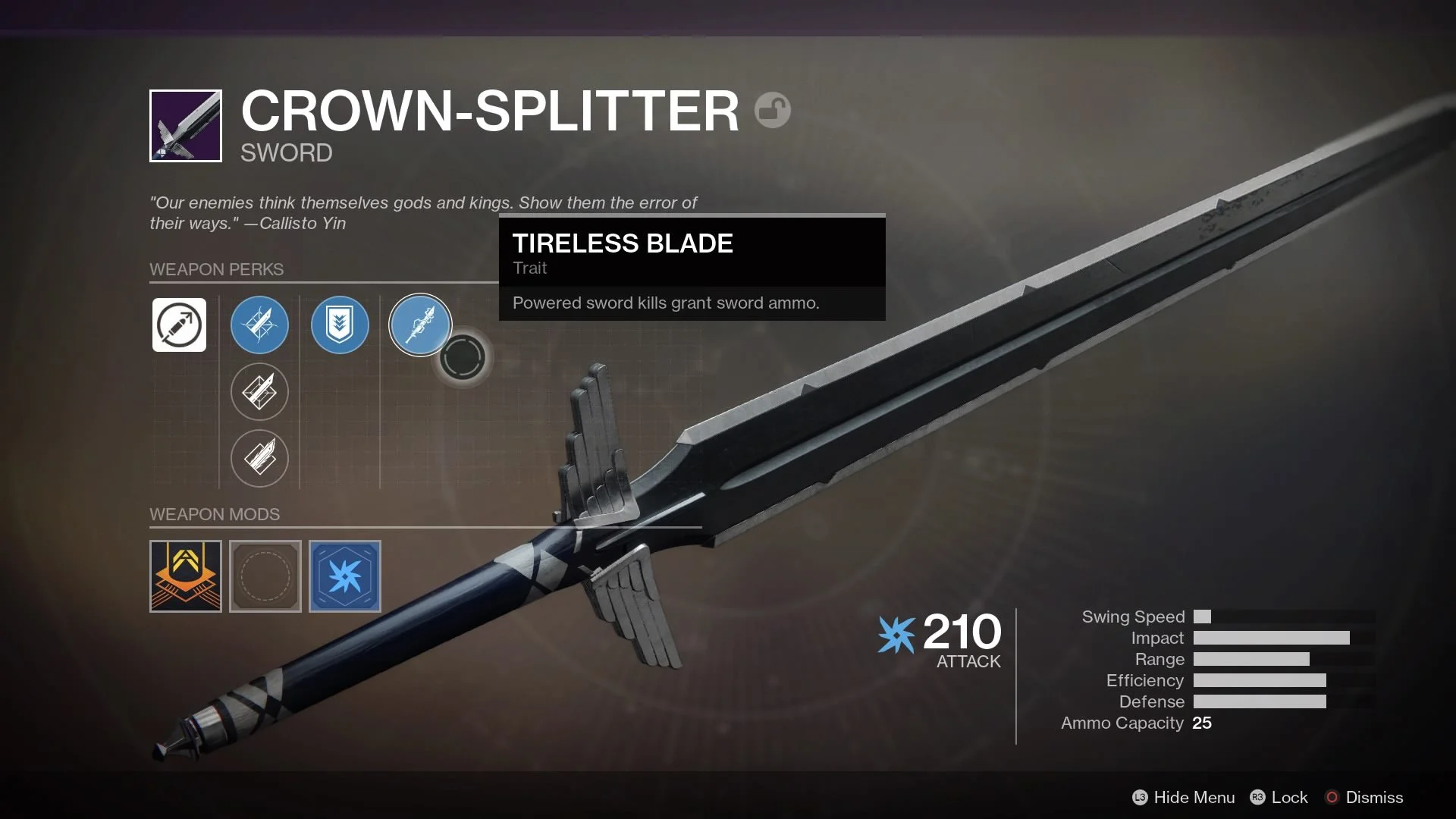
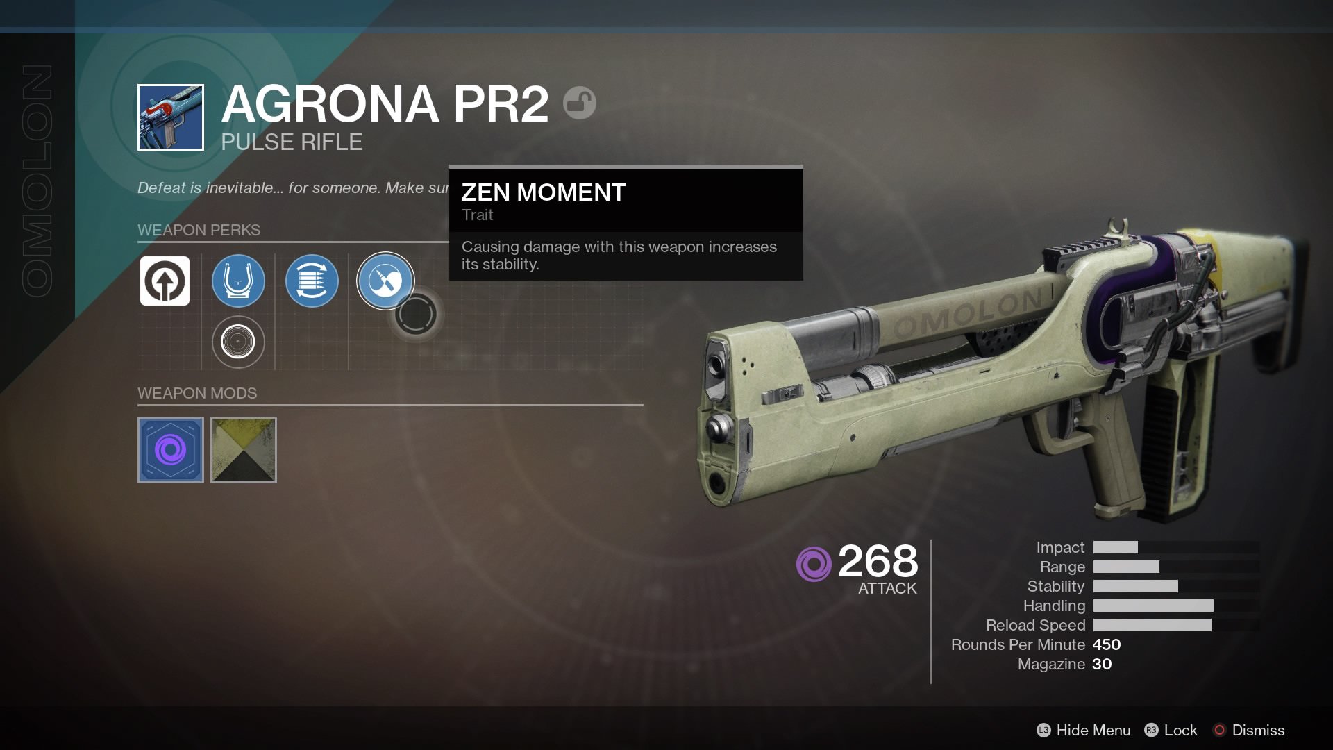
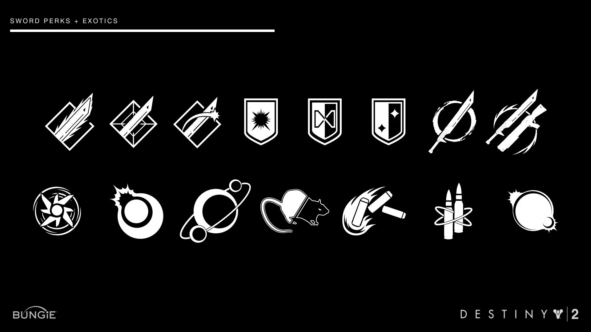
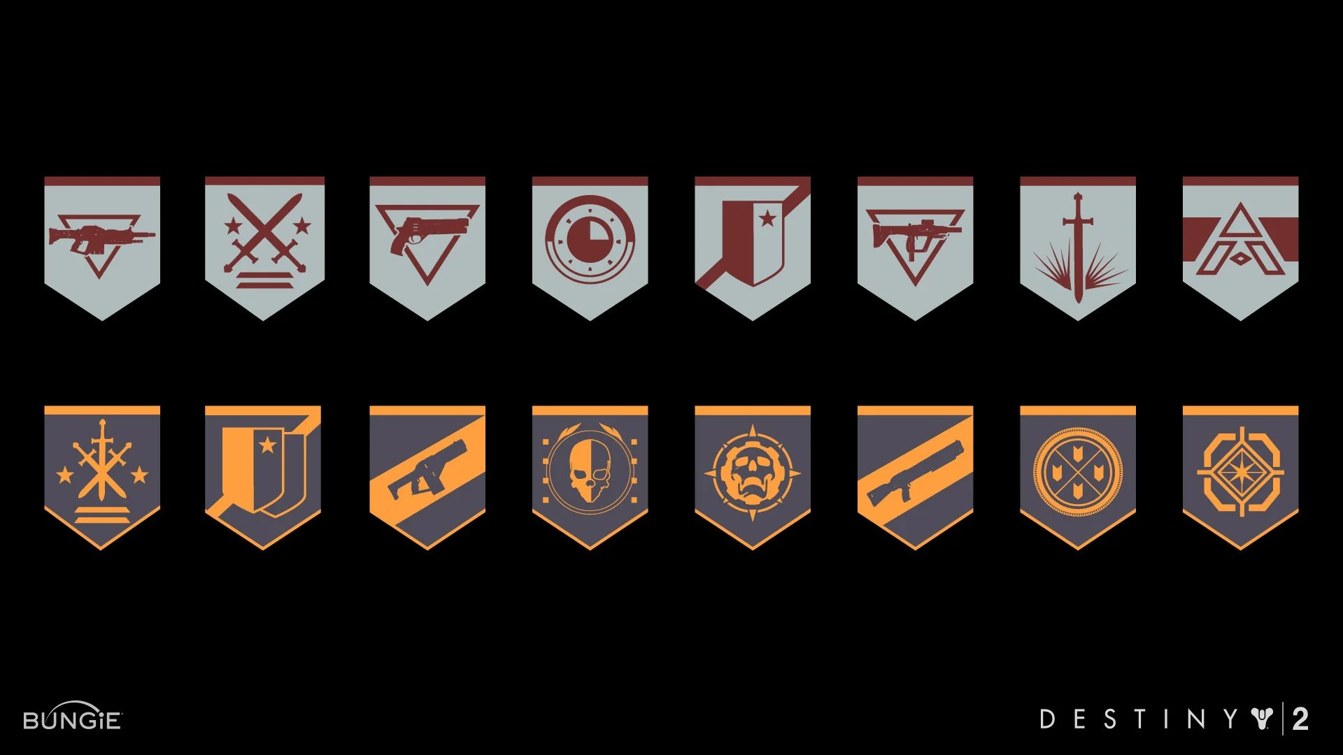
I was responsible for designing hundreds of icons used in the HUD, inventory screens, and ability mod systems. I also ensured visual consistency across categories, handled technical handoff and spec work, and contributed to accessibility and legibility standards across multiple resolutions and devices.
Challenge
We had a matter of weeks to finalize and implement a massive library of gameplay icons. The challenges were threefold:
Readability at speed: Destiny 2’s combat is fast and fluid; players needed to instantly recognize effects, mod types, and cooldowns without breaking focus
Lore and storytelling alignment: Each icon had to reflect Bungie’s deep visual language and world-building, even when tiny on screen
Cross-platform clarity: Icons had to work across PC, console, and varying screen sizes without loss of clarity or consistency
I had to ramp up quickly in both design and game context, while delivering production-ready assets under extremely tight deadlines.
Approach & strategy
With limited ramp-up time, my strategy was simple: immerse myself. I played the game constantly to understand pacing, weapon behavior, and player flow.
I absorbed everything I could—attending storytelling sessions, observing how other artists approached visual language, and learning the design systems that tied Destiny’s lore to its gameplay. By diving in, I could design icons that weren’t just visually clear, but felt true to the world Bungie had built.
Execution
I used real-time gameplay as research, watching how weapons moved, how players interacted with mod systems, and how split-second choices were made.
From there:
Sketched concept drawings directly inspired by weapon silhouettes, scopes, and abilities
Referenced Destiny 1 iconography to identify where to evolve vs. maintain visual consistency
Reviewed work closely with UI leads to meet technical and narrative fidelity
Delivered polished vector and bitmap icons optimized for multiple screen sizes and platforms
Helped QA visual clarity across HUD and inventory states under active gameplay conditions
Outcome & impacts
Delivery on Deadline: Completed and integrated over 400 polished HUD icons within a 3‑month sprint ahead of Destiny 2’s September 2017 launch.
Enhanced player experience:
Internal QA reported a 30% drop in misclicks during mod/perk selection.
Icon clarity scored 92%+ in readability across platforms.
Supporting a massive launch:
Destiny 2 reached an estimated 1.2 million concurrent players during its opening weekend in Sept 2017.
Daily player base remained strong, with 600k+ active users during the early 2018 cycle.
📈 Business Outcome:
Contributed to the polished, immersive UI that supported Destiny 2 becoming the second highest‑selling console game in North America in 2017, helping cement Bungie’s post-Activision legacy.
Reflections
Working on Destiny 2 pushed my ability to deliver high-quality UI under pressure. I learned to rapidly balance visual clarity with narrative intent, while adapting to a fast-moving production pipeline. The experience sharpened my skills in cross-functional collaboration and deepened my respect for how tightly gameplay, art, and usability must align in a live game environment.
It also underscored that even the smallest UI detail like an icon can carry immense weight when it’s part of a world players care deeply about.