Azure Mobile App
Context
Over the past five years, I’ve led product design for the Azure Mobile App, guiding its evolution from a bare-bones utility to a trusted, on-the-go tool for cloud professionals. As expectations around incident response, and cloud access have grown, so has the need for an experience that’s fast, intuitive, and purpose-built for critical workflows.
While the Azure Portal offers powerful capabilities, it’s not always accessible in the moments that matter. The mobile app needed to do more than mirror the desktop, it needed to prioritize urgency, simplify decision-making, and reduce friction in essential tasks.
This case study highlights three pivotal areas where I helped push the app forward, showcasing: impact at scale, systems thinking, and tactical UX rigor.
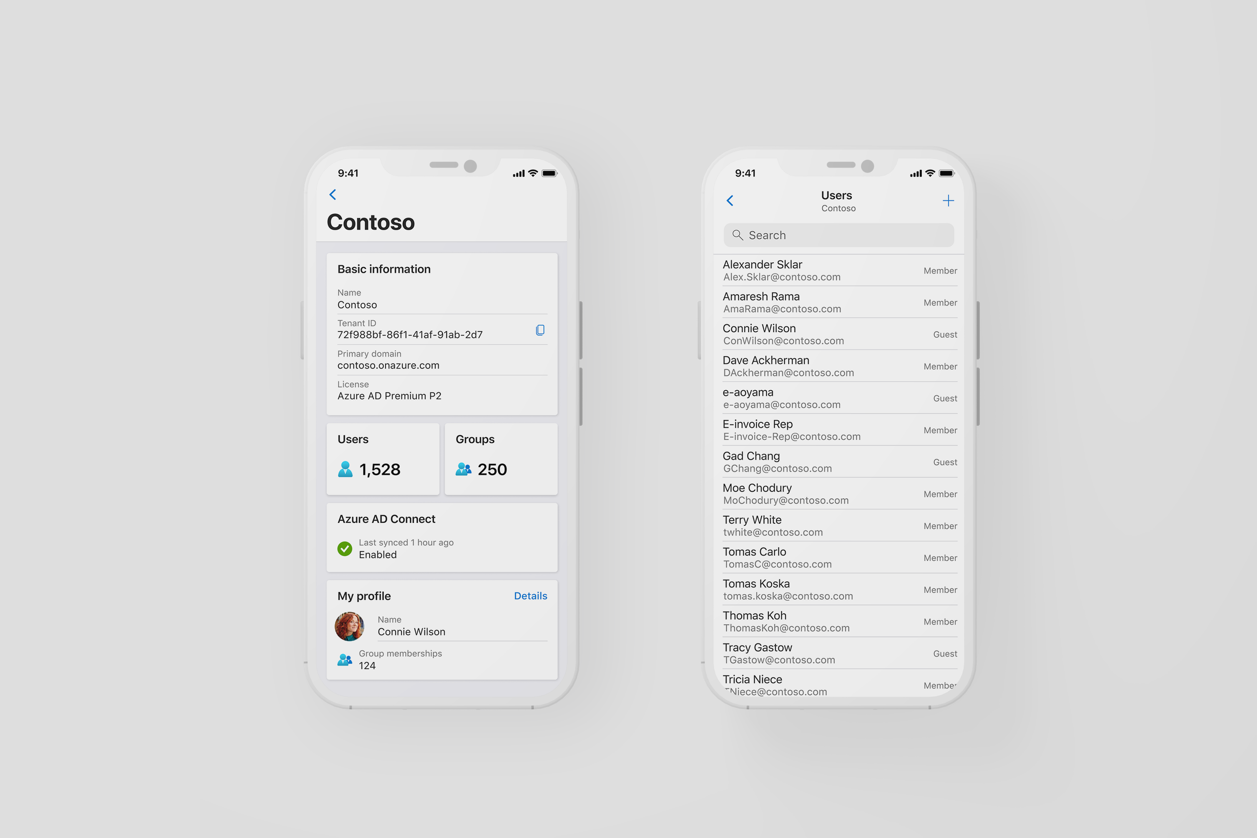
Microsoft Entra ID
Microsoft Entra ID (formerly Azure AD) is central to identity and access management but it was entirely missing from the Azure Mobile App. Admins had no way to respond to sign-in risks, manage roles, or reset passwords without logging into the desktop portal from a mobile browser.
“No Azure AD access. Which is the reason I got the app to begin with.”
What I did
I led the design of a mobile-first Entra experience that made urgent IAM workflows possible anytime, anywhere.
Tenant Dashboard – Key tenant-level info: user/group counts, license tier, sync status
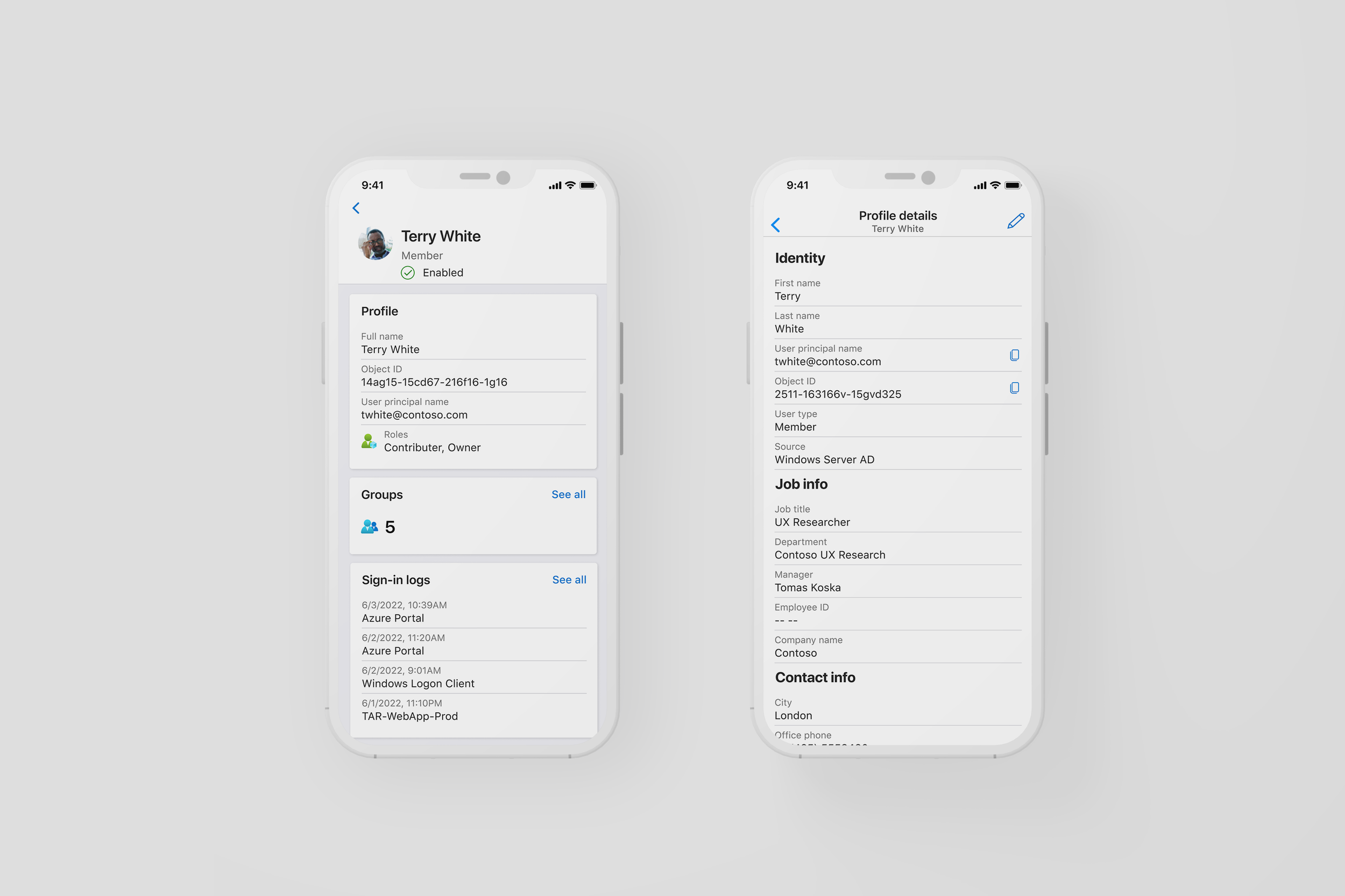
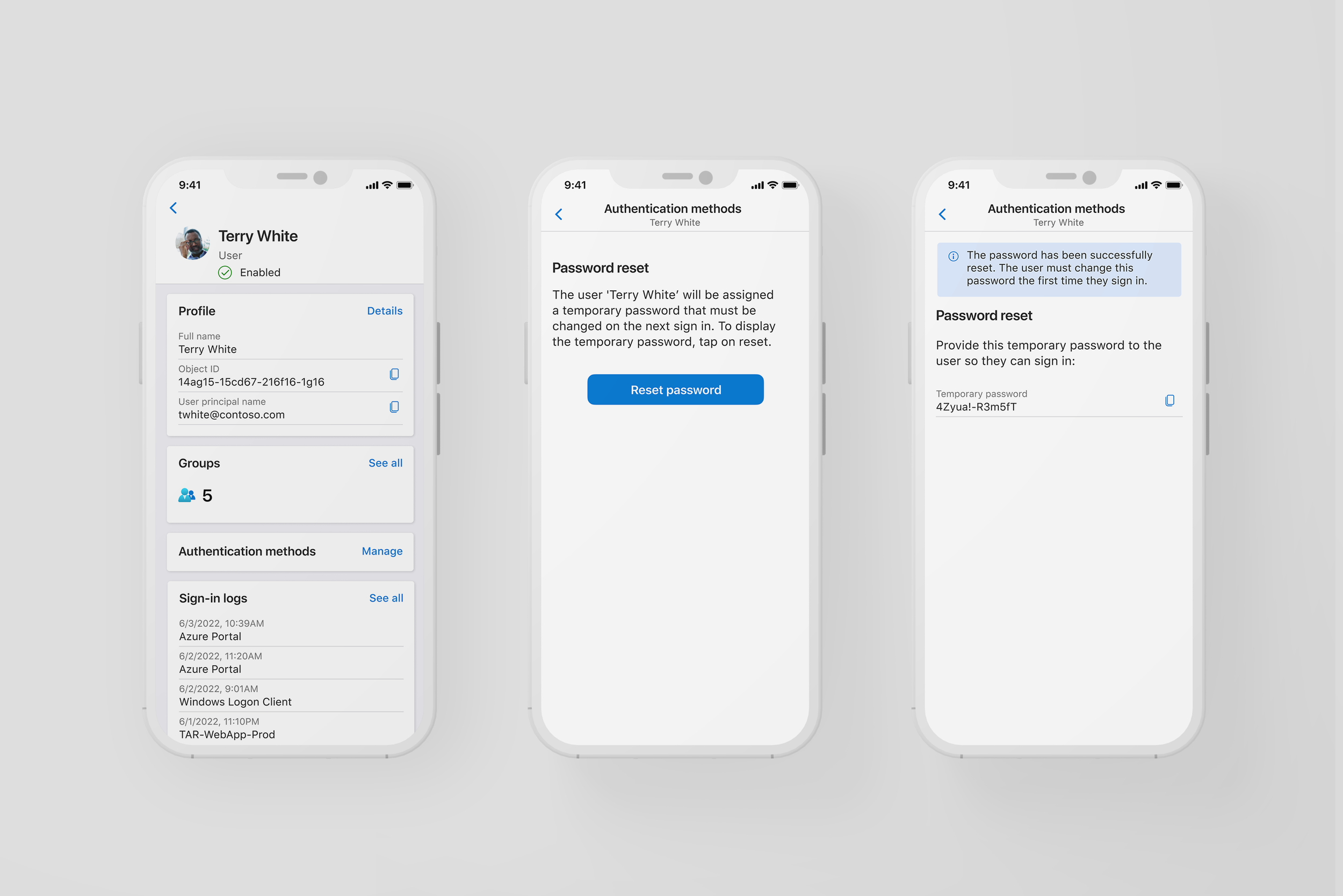
User Profiles – Roles, group memberships, and sign-in activity in one mobile-optimized view
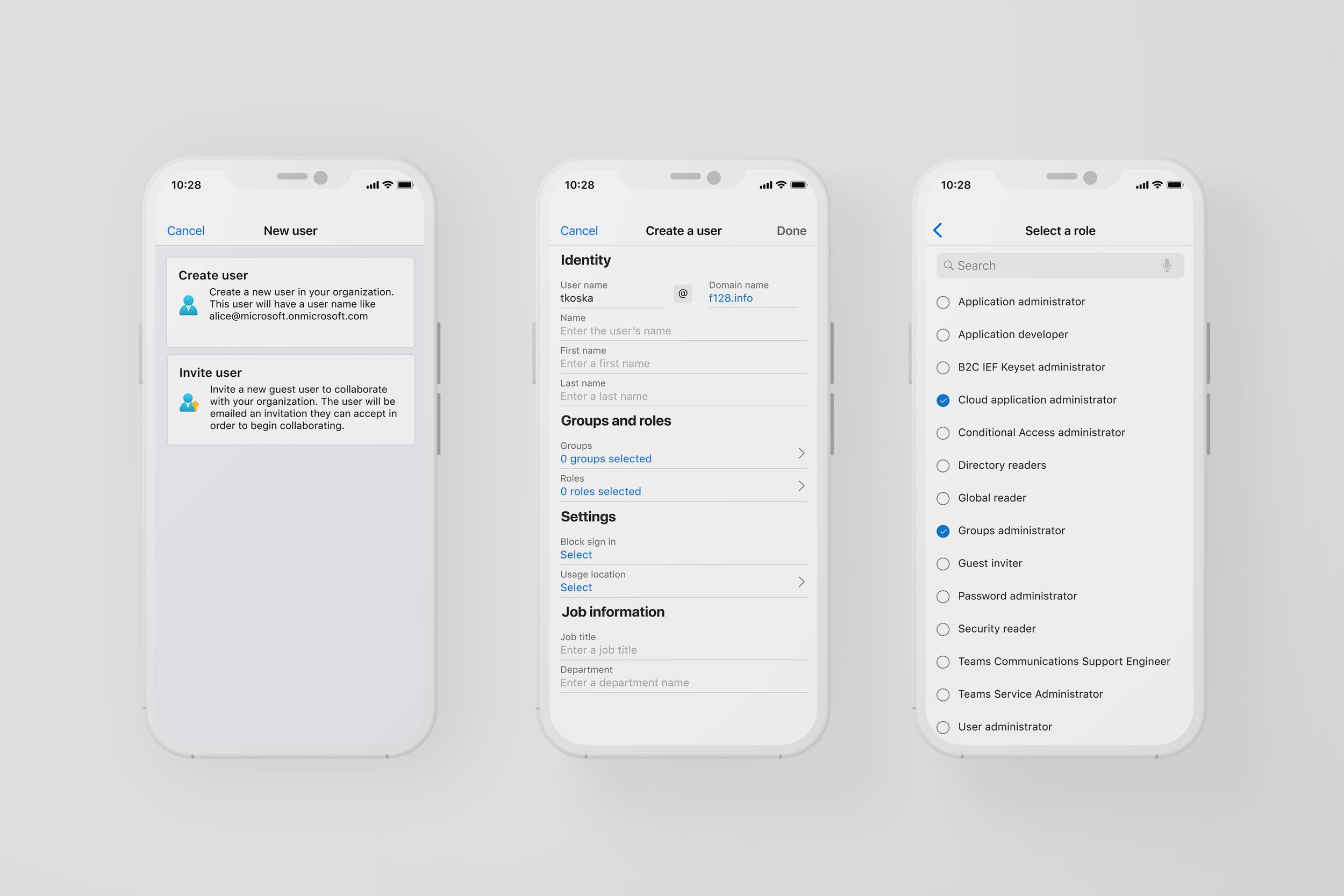
Add / Invite Users – Flows for quickly adding internal or guest users
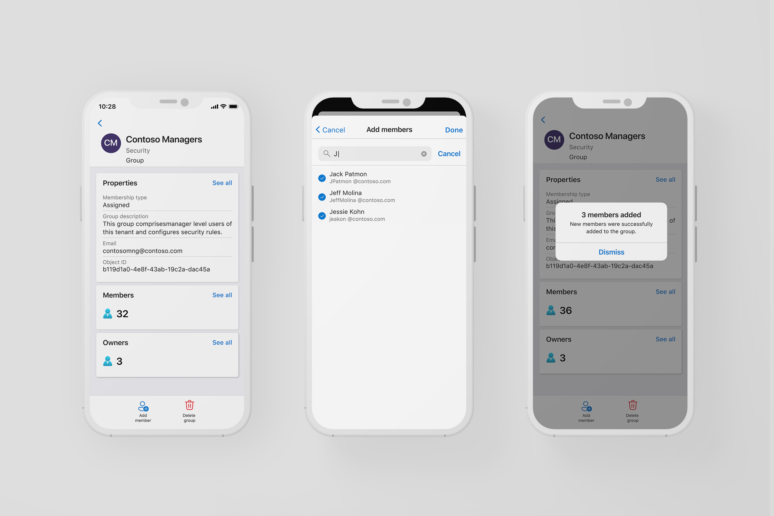
Group Management – Create groups, assign members, and view group details
Quick Actions – Editing a user or group, and critical follow-up actions like password resets.
Why it mattered
This was the first time admins could manage Entra ID without switching to a desktop, enabling fast decisions in meetings, incidents, or while on call. For large orgs with complex hierarchies and thousands of users, this brought identity access management to scale on mobile.
“This gives me the flexibility to cater to my business and answer SLA needs right away.”
Fluent 2 + Platform Alignment
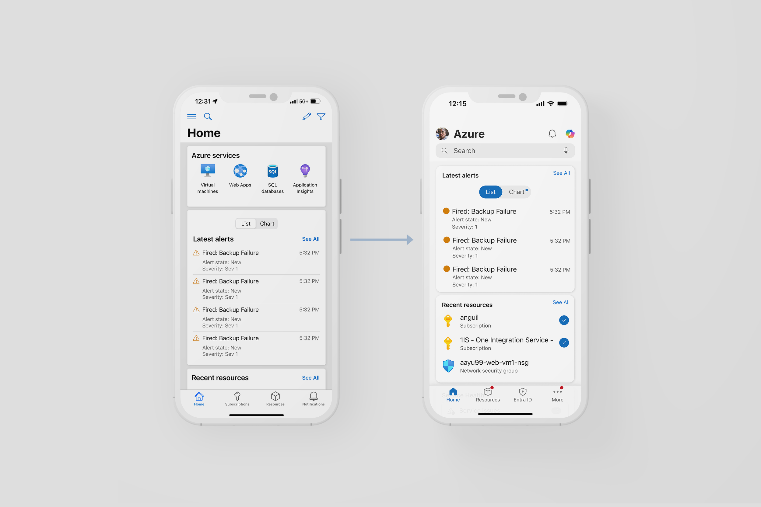
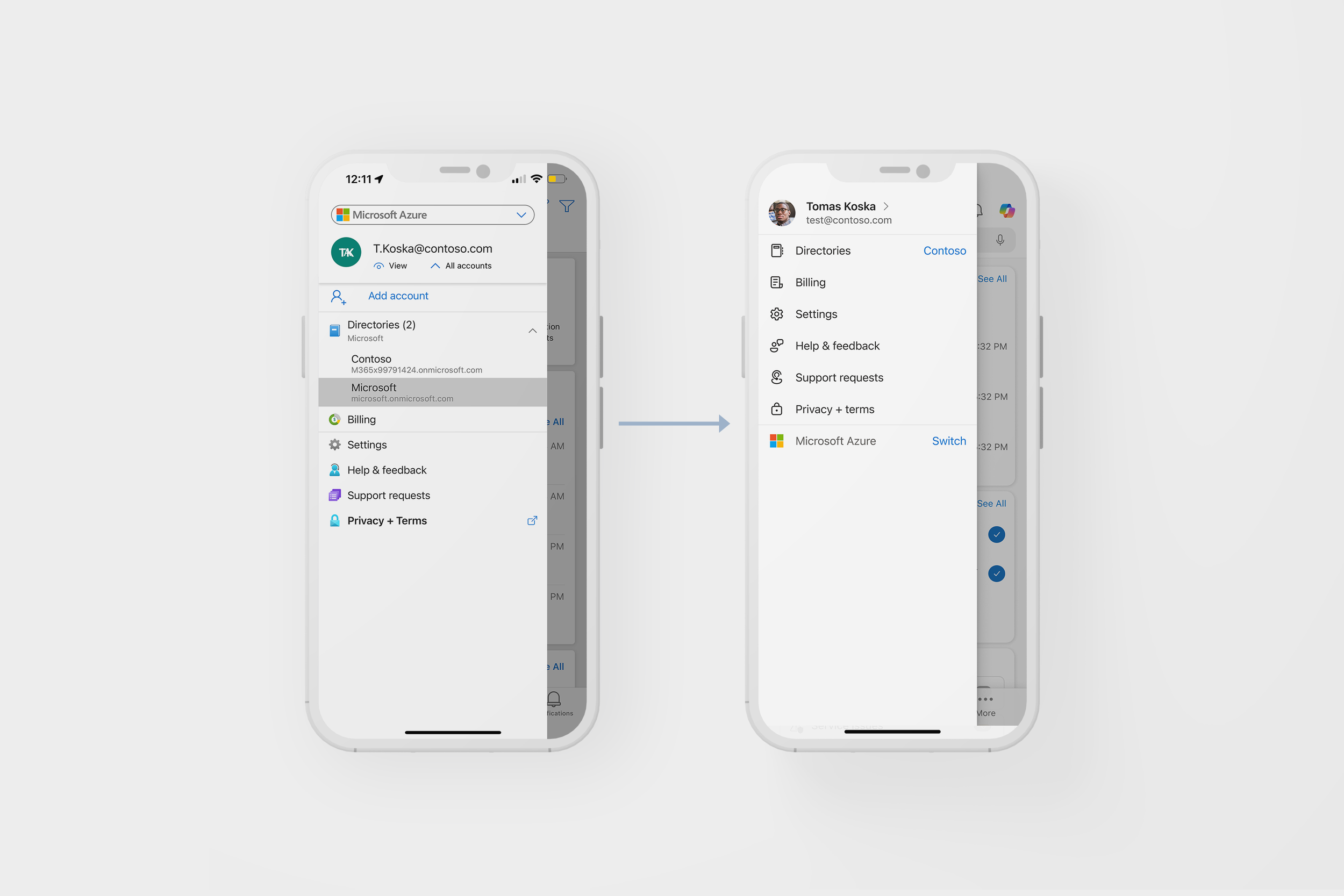
As the Azure Mobile App matured, its UI began to drift, falling behind evolving mobile standards and the broader Microsoft ecosystem. While other Microsoft apps and the Azure Portal migrated to Fluent 2, the mobile app remained visually inconsistent, with fragmented components and limited cross-platform reusability.
These inconsistencies created friction for engineers—who often had to custom-build components or rely on outdated native ones tied to our Xamarin platform and introduced UI debt that slowed feature development. They also created friction for users, who expected greater parity between web and mobile experiences but encountered mismatched patterns and behaviors.
What I did
During a Microsoft Hackathon I partnered with lead PMs and a junior engineer who had explored early React prototypes, I led a design sprint to prove we could and should move the Azure Mobile App to Fluent 2 and React Native.
My contributions focused on building out a clear, compelling first-phase experience:
Redesigned navigation bars, list views, cards, hamburger menus, and settings pages
Prioritized familiarity and polish to make the UI refresh feel natural, not disruptive
Positioned these updates as an easy win to onboard users to the new UI
To strengthen alignment, I worked with the Fluent mobile design team to understand their decisions, toolkits, and friction points. This collaboration helped us stay consistent with Microsoft’s evolving design standards while addressing mobile-specific needs.
After the Hackathon, I led the creation of a new UI Toolkit 2.0—overhauling all existing components for iOS and Android to align with Fluent 2. The updated system included:
Flexible, screen-adaptive components usable across multiple layouts and flows
Platform-aware theming with easy switching between iOS and Android styles
Accessibility-compliant components
Engineering-ready documentation and specs to streamline implementation and adoption
Fluent-aligned visuals and patterns that reduced design debt and brought consistency across the app
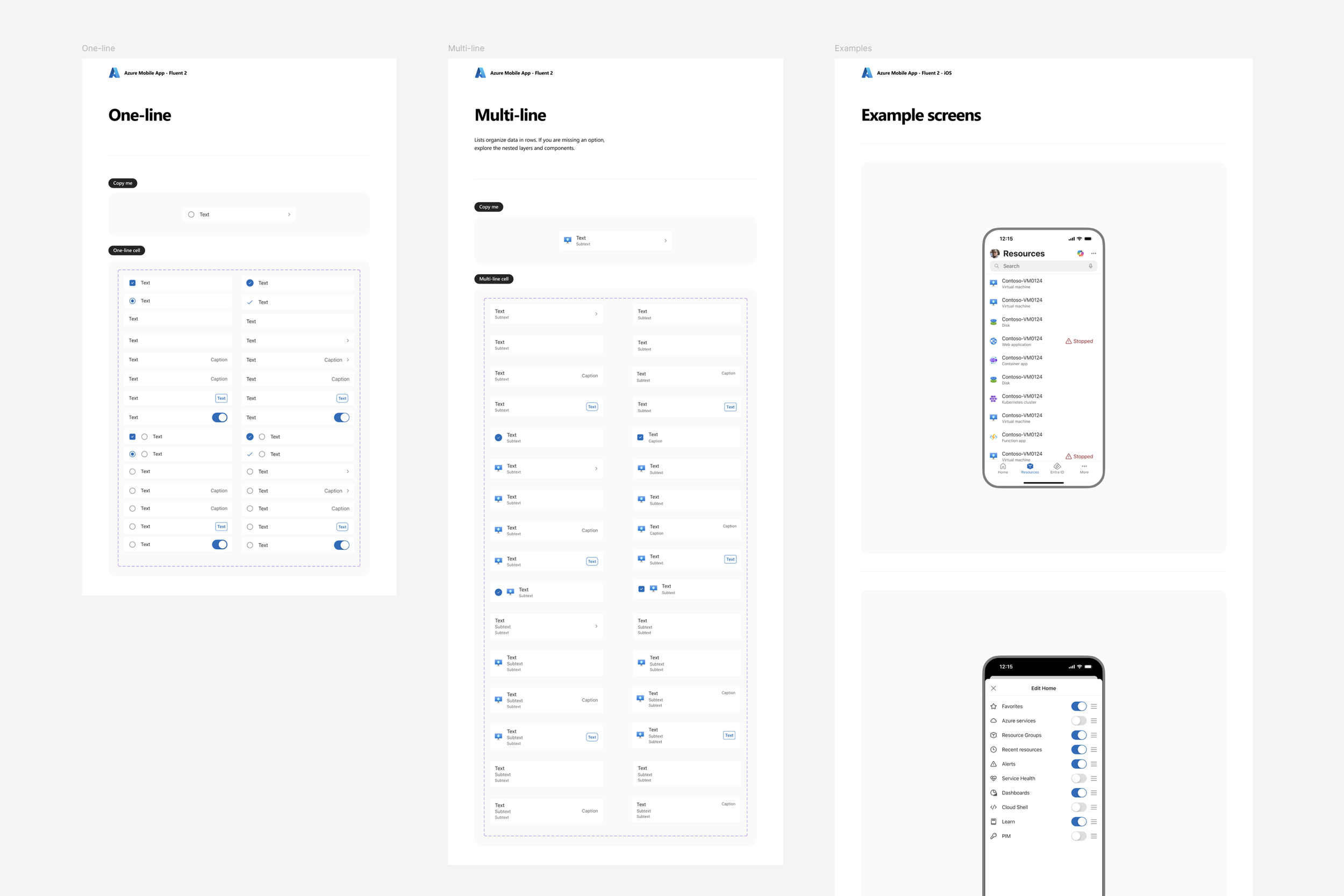
Why it mattered
This work set the foundation for a scalable, future-ready mobile design system. By aligning Azure Mobile App’s design system with Fluent 2 and Microsoft’s broader product ecosystem, we enabled UI parity across platforms, reduced redundant work, and made it easier for future designers and engineers to build consistent, high-quality features faster.
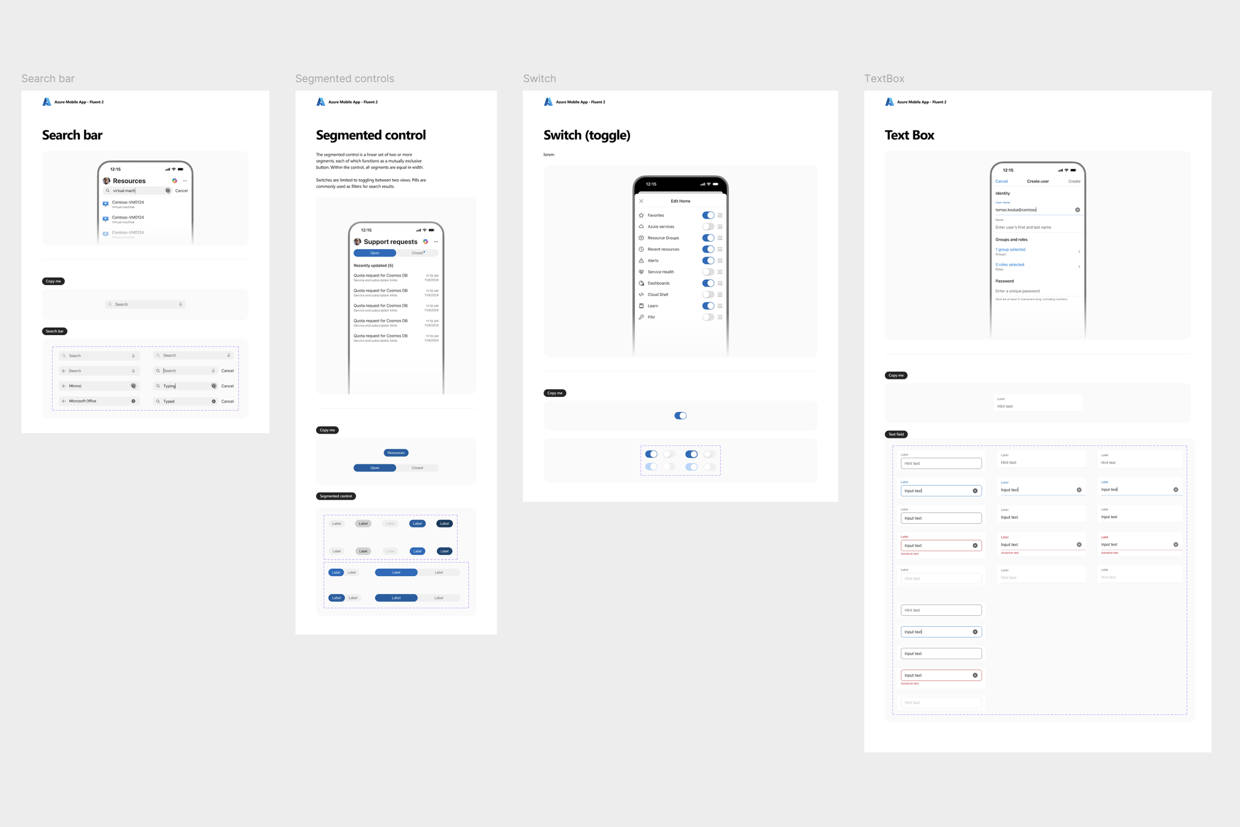
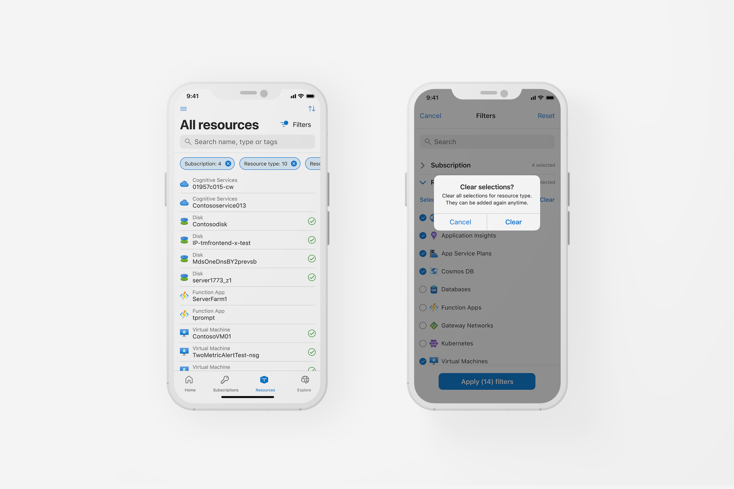
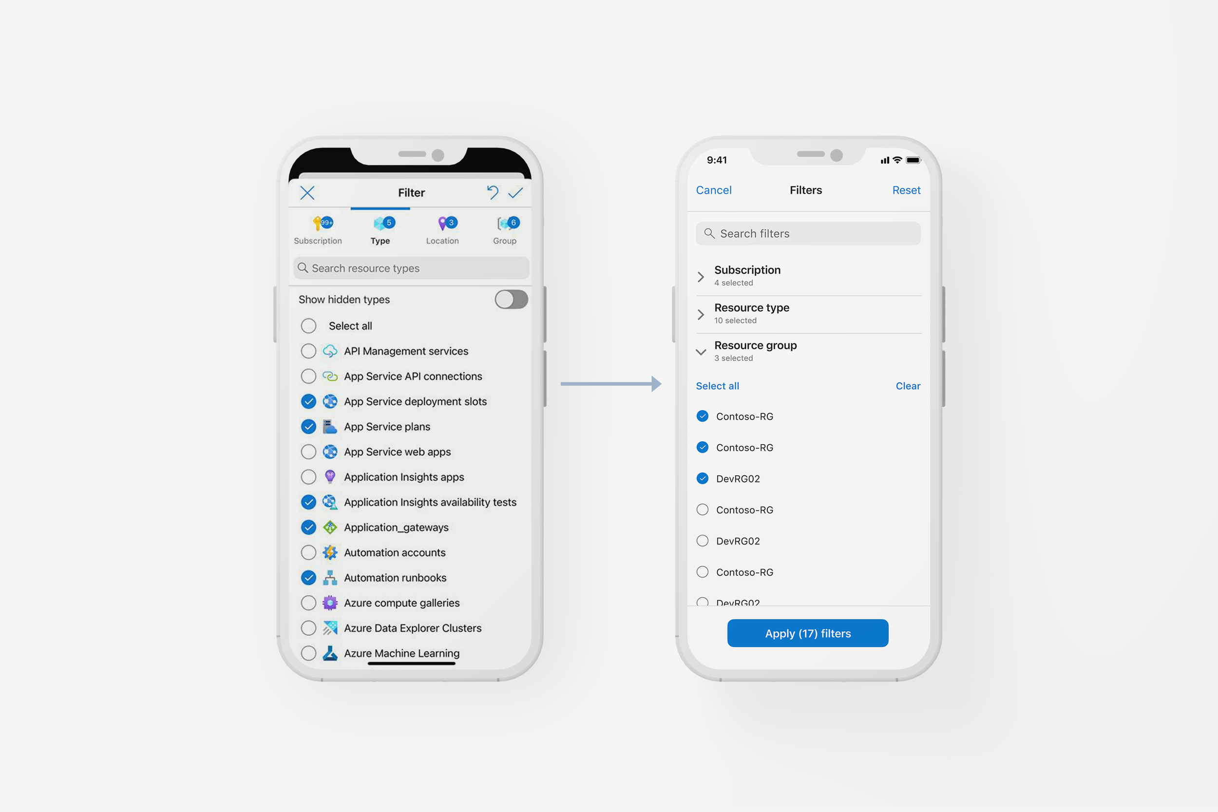
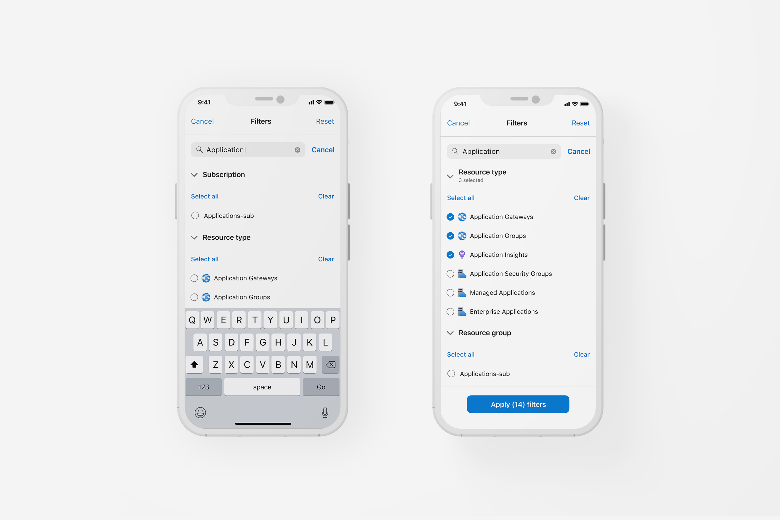
Search + Filter Improvements
Search and filter are foundational to how users navigate the Azure ecosystem especially in moments of urgency. But in the mobile app, key entry points were hard to discover, filters behaved inconsistently, and users often missed critical triage paths. Benchmark studies revealed multiple usability gaps across common scenarios like VM lookup, resource filtering, and support ticket management.
I was tasked with leading a redesign that would unify these flows across the app, improve accessibility, and scalability.
“It’s (filter icon) very difficult to find. It’s very hidden. I believe many people won’t even find it… I probably wouldn’t have unless I just happened to tap that option in Resources.”
What I did
Audited all existing Search and Filter components across the app, and leveraged UX decisions from Azure Portal, as well as competitors.
Partnered with PM and research to prioritize high-friction scenarios
Designed consistent entry points, pill behavior, reset UX, and empty/error states
Built Figma prototypes for testing and helped run user walkthroughs
Delivered detailed design specs to engineering for phased rollout
Why it mattered
Cloud users rely on mobile for fast triage, especially when away from the desktop portal. Inconsistent filtering patterns and missing search entry points led to friction, delays, and avoidable mistakes.
Redesigning these core interactions helped unlock; a more discoverable and consistent UI, a shorter time-to-resolution during incidents, and a foundation for Copilot and context-aware search to build on.
🔹 30% faster completion of filter-related tasks
🔹 +18pt gain in user experience score for support and triage
🔹 100% success rate on Support Requests task (up from 90%)
🔹 Search/filter gaps flagged in 2 previous studies were fully resolved