Crafting the Azure “A” logo
Context
As the hub of the Microsoft cloud ecosystem, Azure needed a modern logo that not only reflected its importance but also aligned visually with the broader Microsoft product family.
The original “A” icon had become outdated and inconsistent with Microsoft’s Fluent Design System and Office Core 10 iconography. To maintain brand cohesion and ensure trust across all surfaces, we set out to redesign the Azure logo to better reflect its role as the core of Microsoft’s cloud offerings. I was responsible for helping shape the creative direction of the new logo and ensuring its successful rollout across product and marketing surfaces. Working with cross-functional partners in Brand, Fluent Design, Engineering, and Legal (CELA), I contributed to it’s visual development, refinement, and strategy.
Challenge
This was not a simple rebrand. The new Azure icon needed to:
Visually align with Microsoft's design system (Fluent, Office Core, Outlook, PowerPoint etc)
Feel familiar and trustworthy to a technical audience
Work across multiple surfaces (mobile, web, marketing)
Roll out globally on a tight schedule
It also needed to preserve Azure’s identity while symbolizing unity across Microsoft’s product family.
Approach & strategy
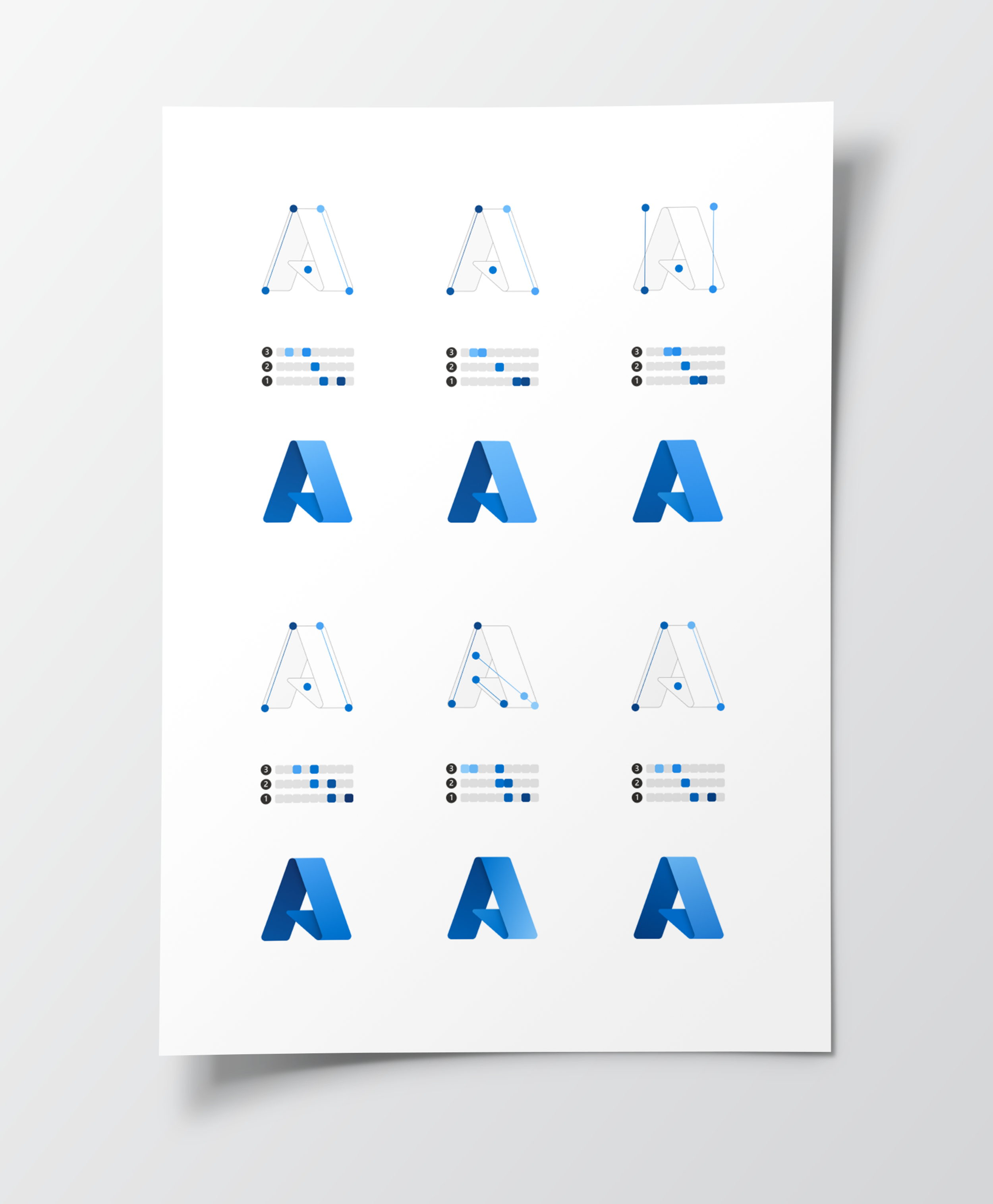
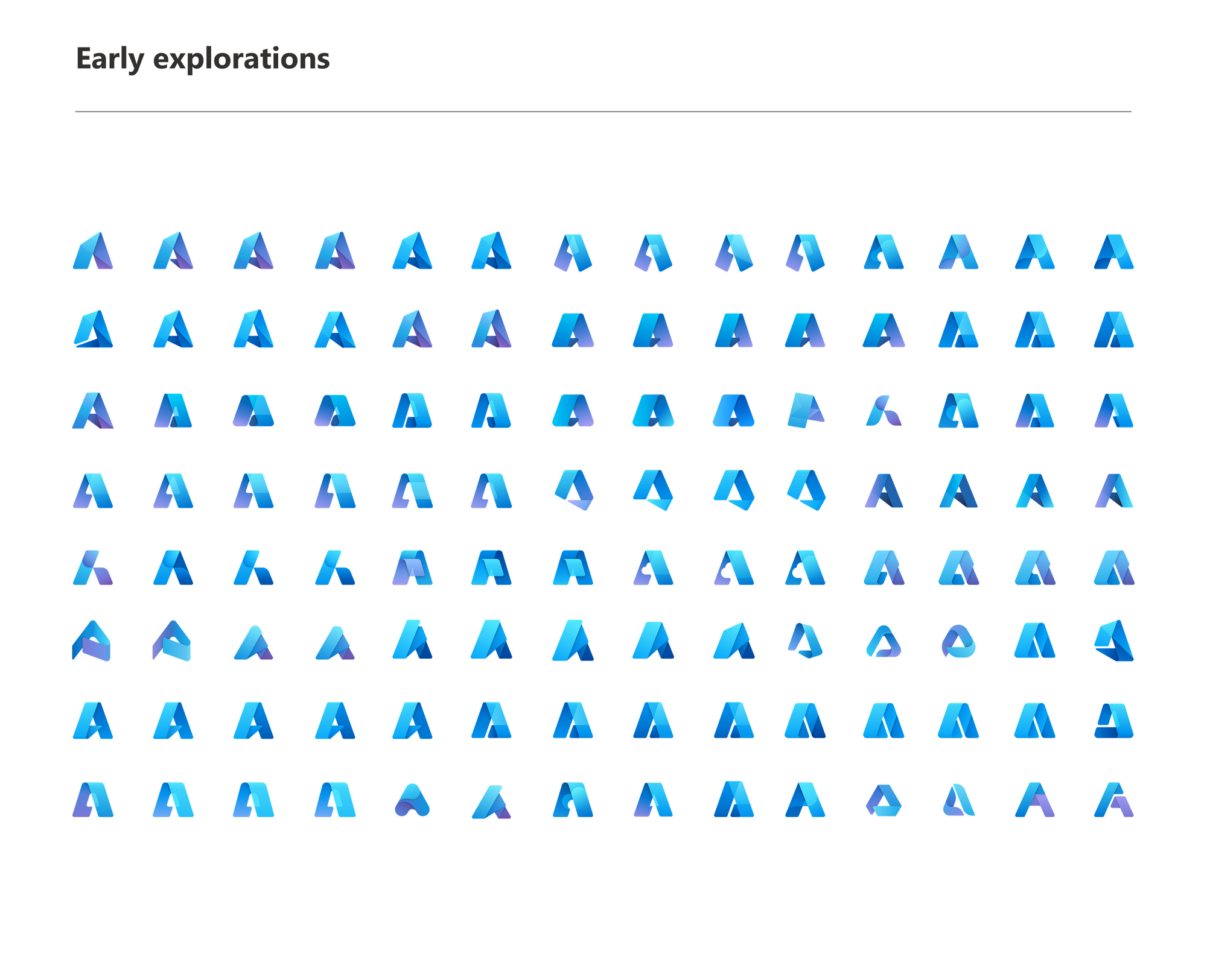
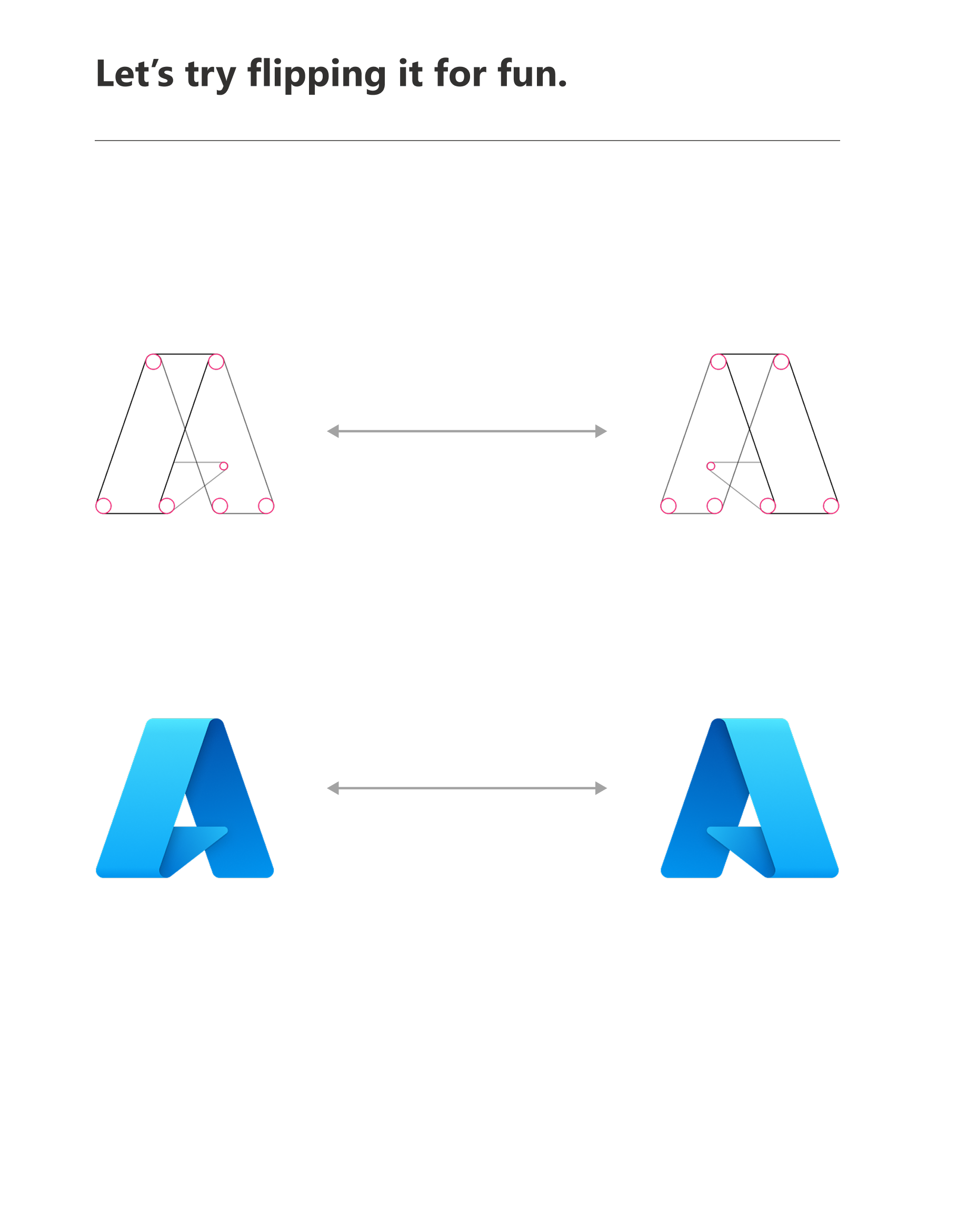
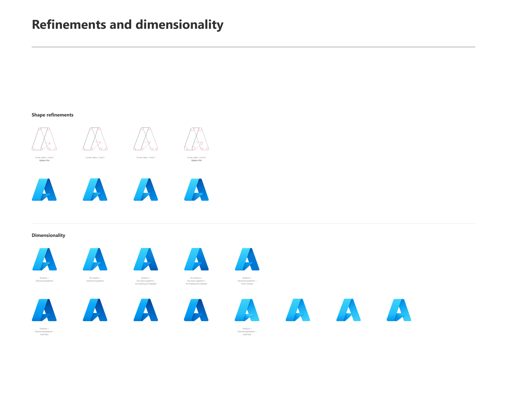
I partnered with the Fluent Design team to explore capital “A” concepts, applying Fluent visual techniques such as folded ribbons, soft corners, and sculpted depth to create an icon that felt modern, recognizable, and aligned with Microsoft’s visual system.
To ensure it resonated with users, we tested early concepts with Azure customers and gathered feedback across key usage contexts. I also participated in executive reviews by showcasing design iterations, confirming alignment with the brand and creative brief, and helping validate that the design direction met both visual and strategic goals.
Execution
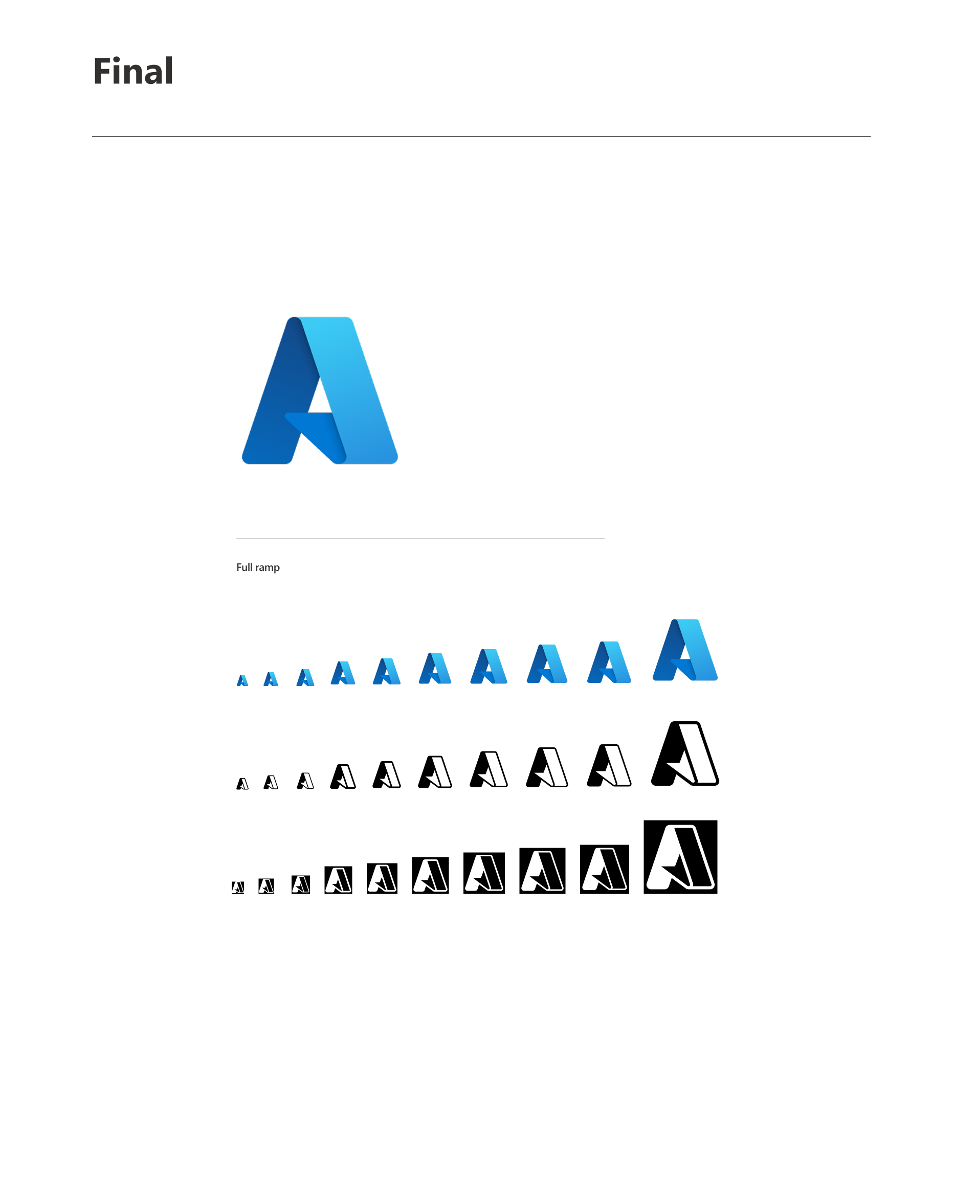
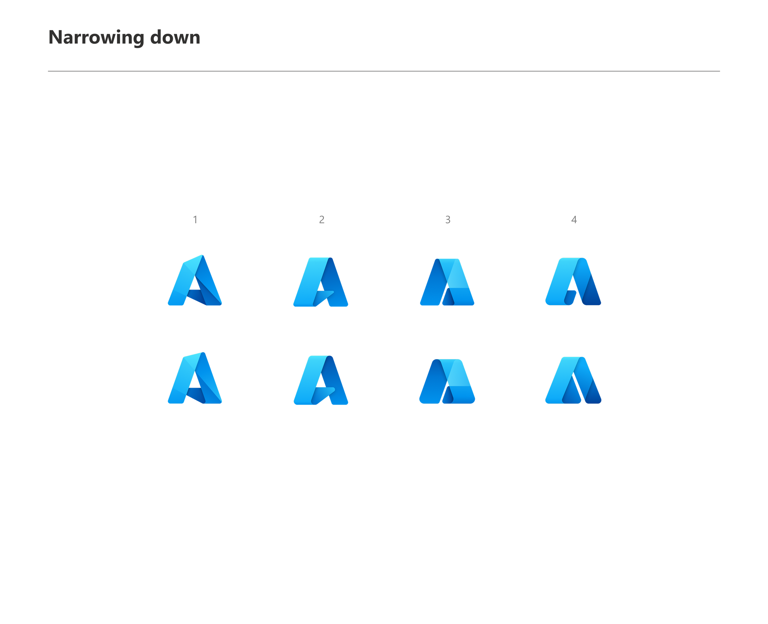
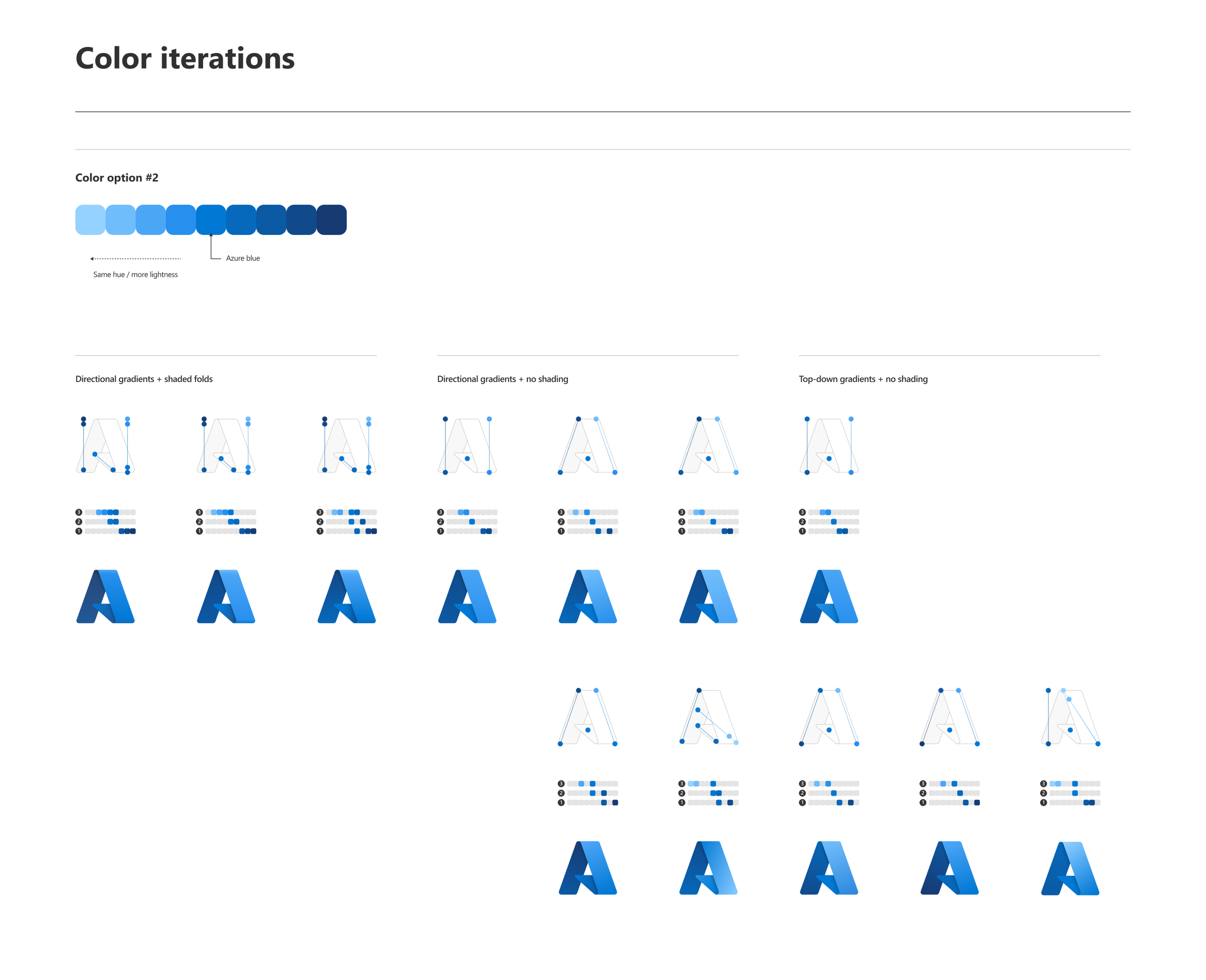
Once the top four logo directions were narrowed down through customer and executive feedback, I refined dimensionality, color, depth, light, and shadow to achieve the right balance and visual harmony for the A-shape. These adjustments weren’t purely aesthetic; they were grounded in principles of visual hierarchy and brand clarity. Subtle use of depth and contrast helped the form feel dynamic without overwhelming the mark, while controlled light gradients reinforced a sense of elevation and movement that ties back to Azure’s core themes of scalability and empowerment. The final execution balanced simplicity at small scales with richness at larger ones, ensuring legibility across both digital and physical applications.
Outcome & impacts
The redesigned Azure “A” icon successfully launched ahead of Microsoft Build 2021 and now appears across all major Azure product surfaces, including the portal, mobile apps, and marketing materials.
Within the first 60 days post-launch:
Icon adoption reached over 95% of global product touchpoints
Azure blog and Design Medium articles announcing the icon received over 250K combined views
The rollout reinforced Azure’s visual authority within the Microsoft ecosystem and was praised internally for its clarity, cohesion, and execution. The work also helped establish a scalable model for future Fluent-based icon rollouts across cloud-facing tools.
Reflections
What stands out most from this project was the collaborative energy behind it. I worked closely with another designer to push and refine ideas in a way that felt open, creative, and shared. There was no gatekeeping, just a genuine commitment to craft something together.
The cross-functional rollout also moved smoothly. Teams across engineering, brand, research, and legal were aligned on the value of getting this right. That level of shared ownership made it possible to deliver a thoughtful, unified icon at a global scale. The success of this project came not just from what we built, but how we worked together to make it real.